The Best German Book Design 2022
stiftung buchkunst awards the best german book design of a year, offers a platform for rethinking the medium of the book with the sponsorship prize for young book design, and networks international book design competitions under the umbrella of best book design from all over the world.
Single title
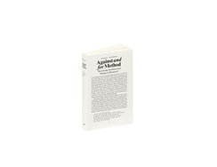
“Can design processes constitute genuine forms of research?” This anthology of writings takes a stand against deadening routine in architecture and...
“Can design processes constitute genuine forms of research?” This anthology of writings takes a stand against deadening routine in architecture and design teaching, the wordplay of its title referencing a manifesto written by controversial philosopher of science Paul Feyerabend. The very look of this pocket-sized book reflects its subject matter, which aims to question conventions at every turn. Though cover boards enclose the book block, conceptually the book is coverless. Instead, the content matter simply starts on the front, which is thus paginated as page 1. And because what is technically page 1, i.e. the first page of the first text, is glued flush with the front cover, the printed page numbering is consistent with the actual physical number of pages. The type area is sensibly laid out, with changes of typeface in the indented headings, chapter titles and footnotes making for a subtle but attractive interplay of grey tones. The otabind cover, meanwhile, results in a hollow spine when the book is opened, ensuring not only that the spine doesn’t break but also that the block opens perfectly. The gutter, where the eye normally never tarries, offers up another surprise: each visible thread of the sewn page binding has a different colour. At first glance, the loose private snap-shot inside the book seems to have wound up there by mistake but, in fact, it is a bookmark intended to accompany the reader’s journey. Printed on photographic paper, it shows the impishly grinning Feyerabend doing his washing up.
- Publisher:
- ISBN:
- 978-3-85676-413-5
- Author:
- Jan Silberberger
- Pages:
- 284
- Price:
- € 30.00
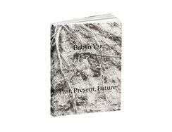
“These are the 28,016 known names of those killed at Babyn Yar, as of the date of publication.” Printed in narrow...
“These are the 28,016 known names of those killed at Babyn Yar, as of the date of publication.” Printed in narrow columns of tiny silver type across 39 pages, that list of names forms the centrepiece of this book. A research project by the Babyn Yar Holocaust Memorial Centre, it investi-gates the unimaginable events that took place over two days in September 1941 when, a short distance from the centre of Kyiv, more than 33,000 Ukrainian Jews were murdered by occupying Nazi forces. Alongside historical texts and photographs, the book also offers impressions of today’s memorial park, which features various commemorative sites (future architectural structures are also planned). The numerous blank pages in the essays are not simply empty. They are spaces for the unknown, for silent pauses and for speechlessness – in short, spaces in which to think. There’s perplexing white space on the picture pages too, cutting into the contemporary streetscapes as though some of the sur-face layer has been scraped away. An old photograph is printed on the following page in exactly the same place, creating a bridge between the contemporary and historical images. Here and there the latter overlap, forming collages in the mind. There are also modern, almost archaeological-looking visualisations set on black backgrounds, reconstructions of key moments in the massacre. On March 1st of this year, Russian missiles landed close to the Ukrainian holocaust memorial. That too is now part of the history of this place. A reminder that remembrance is never done.
- ISBN:
- 978-3-95905-506-2
- Author:
- Nick Axel, Ilya Khrzhanovsky, Nicholas Korodody, Martin Dean
- Pages:
- 388
- Price:
- € 42.00

“From rebellion to institution.” By 1980, three years after locals had voted “yes” to turning Zurich’s Rote Fabrik into an arts...
“From rebellion to institution.” By 1980, three years after locals had voted “yes” to turning Zurich’s Rote Fabrik into an arts centre, the authorities had still done nothing, and their inactivity triggered protests among the local youth. In this book about the venue’s story, six text chapters alternate with visuals that paint a picture of Zurich’s subculture. Attention-grabbing headings in red sans serif type are set on double-page spreads, surrounded by lots of white space, though, in fact, they feel more like slogans than titles for the ensuing sequences of single- and double-page photos. These present close-ups of ecstatic gig-goers, graffitied slogans on building walls, and turmoil on the streets. Acting almost as fan-mag inserts, they reflect the volatile atmosphere of 1980s Zurich. Rebellious youth in Switzerland? It doesn’t quite fit the cliché of a country in which everything is always neat and orderly. Typical of the pictures’ tragicomic atmosphere is the one showing young people jostling with police officers. The latter’s helmeted heads look like billiard balls, while a young woman is seen reaching to grab one of the baskets – except that they aren’t baskets at all, but riot shields made of wicker. A few pages later, we see a marching band marking some traditional occasion, seemingly unmoved by the clouds of tear gas along their route. The impression is of an ongoing city-wide happening. The transparent film wrapper, whose flaps form pockets into which the card- board cover is inserted, is an expression of how well the makers of this book know their audience. Its protest image is thus printed on the film jacket, leaving the cover beneath looking nice and tidy. Despite its almost 500 pages, this is anything but a weighty tome.
- Publisher:
- ISBN:
- 978-3-03926-008-9
- Author:
- Philipp Anz u.a. Sara Arzu Hardegger, Gregor Huber, Markus Kenner, Pete Mijnssen, Susan Peter
- Pages:
- 448
- Price:
- € 46.00
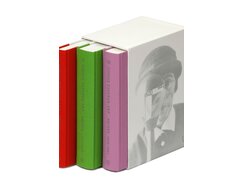
“Note that I am writing to you on the finest linen paper from overseas!!!” Almost 500 letters by the artist Sophie...
“Note that I am writing to you on the finest linen paper from overseas!!!” Almost 500 letters by the artist Sophie Taeuber-Arp are presented in this work, which consists of three volumes and comes in a slipcase. These private letters have a vivacity that’s further enhanced by numerous illustrations. They are transcribed within an almost conventional type area: the margins don’t increase progressively from gutter to footer; instead, the text column sits plumb in the centre of each page. Add in the reference line at the top and the caption at the bottom, however, and the type area starts to look more complex, not least given that the explanatory notes, which are pushed in space-saving fashion almost up to the edges of the page, some-times creep into the letter pages’ type area. The former’s small type size calls for double columns; these are screen-printed in a very restrained grey, which the 80 mesh screen renders easily enough even on book paper. Often it’s considered undesirable for what’s printed on the reverse to be seen through the paper, but then a book page is a physical medium and not a virtual creation. Besides, the subtle, almost Cubist collages that result from illustrations – and type columns – being visible through lightweight paper have an appeal all their own. The body type – Jan Tschichold’s Sabon – feels appropriate not just because it’s a traditional book font, but also because Tschichold, too, was a member of the 20th-century avant-garde.
- Publisher:
- ISBN:
- 978-3-03850-080-3
- Author:
- Sophie Taeuber-Arp u.a.
- Pages:
- 1832
- Price:
- € 136.00
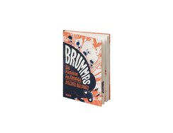
“Note that I am writing to you on the finest linen paper from overseas!!!” Almost 500 letters by the artist Sophie...
“Note that I am writing to you on the finest linen paper from overseas!!!” Almost 500 letters by the artist Sophie Taeuber-Arp are presented in this work, which consists of three volumes and comes in a slipcase. These private letters have a vivacity that’s further enhanced by numerous illustrations. They are transcribed within an almost conventional type area: the margins don’t increase progressively from gutter to footer; instead, the text column sits plumb in the centre of each page. Add in the reference line at the top and the caption at the bottom, however, and the type area starts to look more complex, not least given that the explanatory notes, which are pushed in space-saving fashion almost up to the edges of the page, some-times creep into the letter pages’ type area. The former’s small type size calls for double columns; these are screen-printed in a very restrained grey, which the 80 mesh screen renders easily enough even on book paper. Often it’s considered undesirable for what’s printed on the reverse to be seen through the paper, but then a book page is a physical medium and not a virtual creation. Besides, the subtle, almost Cubist collages that result from illustrations – and type columns – being visible through lightweight paper have an appeal all their own. The body type – Jan Tschichold’s Sabon – feels appropriate not just because it’s a traditional book font, but also because Tschichold, too, was a member of the 20th-century avant-garde.
- Publisher:
- ISBN:
- 978-3-446-27255-2
- Author:
- Dita Zipfel
- Pages:
- 144
- Price:
- € 15.00
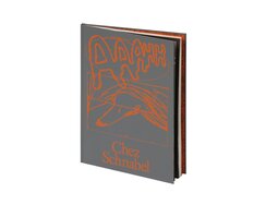
“The eagle looks up / and shows the way / with a trout.” ...
“The eagle looks up / and shows the way / with a trout.”
Such enigmatic verse is just one facet of this folio-format exhibition catalogue, published to mark Anna Haifisch’s LVZ Art Prize win.
Wrapped in mouse-grey synthetic leather, the slender page block exudes the earthy print-shop smell of paper freshly impregnated with ink, providing an apt olfactory accompaniment to the mood of that cover, onto which a sketch has been screen-printed in pale rust red. It’s a captivating introduction to this comic artist’s world.
After the typographic deconstruction of the preface, we find artwork presented as full-page images or picture quartets against backgrounds of varying colour. The cluster entitled “Das diskrete Auge” (“The Discreet Eye”) testifies to the artist’s mastery of her craft. It shows the fingers of a hand parting the slats of a blind, revealing through the narrow, sharply tapering gaps a dissected view of the demolished building across the way. The thin lines of the diagonals, the variation in density, the overlaps and spatial depth – all this lends the image a sense of drama despite its ostensible lack of action. The key motif here is longing, the desire to move from passive observation to active participation. The scenes are heavy with ironic melancholy – much as print-shop air is heavy with ink.
- ISBN:
- 978-3-95905-603-8
- Author:
- Leipziger Volkszeitung, Museum der bildenden Künste Leipzig, Björn Steigert, Benjamin Schrader, Dr. Stefan Weppelmann
- Pages:
- 96
- Price:
- € 26.00
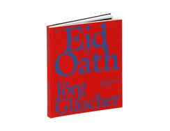
“Kyrgyzstan went through a phase in which it changed presidents and governments almost monthly.” ...
“Kyrgyzstan went through a phase in which it changed presidents and governments almost monthly.”
Just one observation from this photographic monograph’s supporting text. Unusually, that text doesn’t preface the images, instead coming in the middle of the book, where it is printed in reverse type – i.e. white on black – on thin, absorbent paper. The photos, shot across four continents, are reproduced on sturdy, satin-matt art paper, unaccompanied by captions or comments. Instead, they themselves provide the commentary, depicting individuals or scenes that relate in some way to state authority and the separation of powers.
The cover reminds us that cloth is softer than paper. It’s a sort of quarter cloth binding – the flexible front cover is clad entirely in cloth, while the stiffer rear cover features laminated paper.
With no introduction, the book takes us straight into the image section, starting with a suggestive shot of three middle-age men clad in black robes and silhouetted against a red wall. They seem to be taking a break from some heated debate (tempting refreshments are visible in the background): the figure in the middle, apparently still gripped by whatever was being dis-cussed, has his hand raised in an upturned claw, as though attempting to seize hold of the arguments that would win his interlocutor over. A similar intensity is evident in the other photos too, their narrow white paper frame – only the gutter features a larger margin – never detracting from the potency of the compositions.
When a state’s powers are separated out, what holds it together? The answer is open to debate, but this book at least illuminates the question.
- Publisher:
- ISBN:
- 978-3-96070-076-0
- Author:
- Jörg, Gläscher; Sonja Zekri
- Pages:
- 208
- Price:
- € 45.00
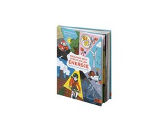
Energy has always been essential to the modern, technological age, but the debate around it has changed. Today, we have...
Energy has always been essential to the modern, technological age, but the debate around it has changed. Today, we have to deal with an ever growing appetite for energy and contend with conundrums such as “What would happen if there was a power cut?” and “Can we not just make do with less?”
The images in this non-fiction book perform multiple functions, being educational, illustrative and entertaining too. They serve to visualise technical processes, such as how a hydroelectric dam generates electricity, but also include circular vignettes that break up the texts, and even a rubber duck explaining: “What you see here is a water model.”
The compositions are similarly varied: some form background images spread across full-bleed pages, others are partially or completely isolated. Outlines, on the other hand, are of consistent weight throughout, as per the conventions of both didactic illustration and traditional cartoons. Halftone areas with unusually wide spacing further emphasise the cartoon look, calling to mind old-fashioned black-and-white comic strips, though, here, the dots help to create subtly shimmering colours. And electricity gains a smiling face, being represented by sparky little flashes of yellow ball lightning.
- Publisher:
- ISBN:
- 978-3-407-75610-7
- Author:
- Christina Steinlein
- Pages:
- 94
- Price:
- € 16.00
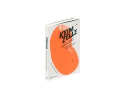
“Once there was a little garden in Hamburg that combined art, politics and vegetables, both in theory and in practice.”...
“Once there was a little garden in Hamburg that combined art, politics and vegetables, both in theory and in practice.”
The cover of this publication about that garden displays a large, juicy bean, rendered in a bold orange spot colour. The inside covers feature a second spot colour, in the form of solid blocks of dark mossy green, while the plan and location map on the flaps testify to the fact that this Utopian place, nicknamed “Keimzelle” or “Seedbed”, did genuinely exist – from 2011 to 2019.
Continuing the garden’s story via the medium of print, the book features double-page collages that teem with bounteous life and sprawl free-form across each spread. They are an expression of the project’s idealistic vigour. Essays on its principles and on aspects of urban sociology are typeset in captivating fashion. Bold orange is again deployed to striking effect on the chapter dividers, in the form of self-empowering protest-style spray-painting and again in the footnotes, where it signposts the academic under- pinning to the essays’ arguments. Except that, here, the footnotes are neither located in the footer nor in the page margins. Instead, they encroach into the main column, forming orange bubbles that are embedded with the type area like organelles within a cell. Something even more remarkable occurs within the editors’ own texts, in which sinuous pathways of white space meander right through the type area. Proof if proof were still needed that those mossy green expanses should be read as a metaphor for fertile humus and fruitful collaboration.
- Publisher:
- ISBN:
- 978-3-8376-5550-6
- Author:
- Anke Haarmann und Harald Lemke
- Pages:
- 224
- Price:
- € 25.00
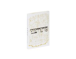
“Enhanced hearing”, “levitate”, “freeze objects”, “heal with light” ...
“Enhanced hearing”, “levitate”, “freeze objects”, “heal with light”
Just some of the faculties imagined by this experimental project. A collaboration between various renowned art institutions in the Meuse-Rhine region, it revolves around the transcultural elements of earth, air, fire and water.
The design of the exhibition catalogue, too, has an experimental feel. Does the title’s mysterious lettering, for instance, represent a lost civilisation or a futuristic one? Using the same symbolic language, the cover’s XL flap visualises a sort of magical, alchemical periodic table. Perhaps these are elements from another world, and indeed the book’s texts, comics and photographic essays do seem to depict something otherworldly. Strange-looking colours in deep tonal values lend the photo reproductions a peculiar cast, as if they were the record of an expedition into atmospheres of indeterminate composition.
No less atypical are the rules for the setting of different text types. On narrower pages are interviews that play with the question-and-answer for-mat, the paragraphs of the answers suddenly jutting leftwards into the questions column. This gives the spreads an entirely unpredictable feel, though there is still a clearly defined logic at play here. The justified text of the statements, on the other hand, alternates between the full-width horizontal blocks that start each section and the narrower-set paragraphs that follow. It makes for an imperious-looking but also somewhat ambiguous type area – one whose elements are combined in ever changing ways.
- Publisher:
- ISBN:
- 978-90-830159-4-1
- Author:
- Persis Bekkering, David Habets, Grace Ndiritu, u.a.
- Pages:
- 292
- Price:
- € 25.00
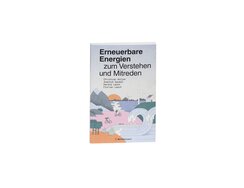
“It’s entirely possible that you’ll come to different conclusions than us. But that’s okay…” ...
“It’s entirely possible that you’ll come to different conclusions than us. But that’s okay…”
So says this handbook, which offers an objective and easily comprehensible overview of various kinds of non-fossil energy sources.
On top of the editorial structuring of the book’s content, the typography too offers clear differentiation. Then there’s the artwork, which encompasses vector graphics that add to the reader’s understanding, factual diagrams that visualise relationships or processes, sometimes accompanied by small illustrations, and chapter-intro spreads whose full-page images maximise the visual appeal.
Objects and bodies are precisely outlined to create geometrically abstract shapes; these are occasionally exaggerated for comic or ornamental effect. The muted, pastel shades lend the images a friendly, positive ambience. It’s perhaps unsurprising then that the illustration style should call to mind pop art, a movement that helped fire an optimistic sense of better times ahead. Faith in technological possibilities can still serve us well today, stopping us from feeling powerless in the face of apocalyptic climate scenarios.
Amorphous substances such as clouds, water, steam and smoke are especially strikingly and successfully rendered by the illustrator. Perhaps a small reminder that when nebulous phenomena are presented in tangible, understandable ways, the factual and fun can combine to inspiring effect
- Publisher:
- ISBN:
- 978-3-570-10458-3
- Author:
- Christian Holler, Joachim Gaukel, Harald Lesch u.a.
- Pages:
- 176
- Price:
- € 18.00
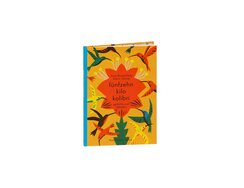
Boasting large blocks of colour, this poetry book’s generous images are not merely illustrations, they also have a quality all...
Boasting large blocks of colour, this poetry book’s generous images are not merely illustrations, they also have a quality all their own. As you might expect, the compositions echo the content of the poems, but what’s more striking is how much breathing space they leave – or perhaps we should say flying space, the primary subject here being birds. Occasionally, the body matter is sculpted into specific shapes, adding a kind of visual poetry – a poem pitying the blackbird’s worm, for instance, is set as a sinuous single column.
The illustrator’s love of fundamentals can be seen in the equal weighting she gives to each of the four ink colours (cyan, yellow, black and a red spot colour in place of magenta), which she uses in largely unmixed form, i.e. almost entirely without halftone modulation. The yellowish white of the stiff matt cardstock acts as an extra hue, while overlaid blocks of solid colour add further shades to the primary-heavy spectrum. A certain degree of halftone modulation can be seen in the dot matrixes of brightened colour blocks; they have an almost cloudy look reminiscent of a “used” silkscreen. Here and there, a dry brush has dabbed colour shading at the edge of a block, further enlivening the juxtaposition between block and space.
It all looks so clean and simple, but reproducing it required frequency-modulated screening, a far from straightforward technique.
- Publisher:
- ISBN:
- 978-3-7795-0667-6
- Author:
- Arne Rautenberg
- Pages:
- 48
- Price:
- € 14.00
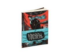
“Once you’ve fallen into a chasm, you see dark possibilities all around.” ...
“Once you’ve fallen into a chasm, you see dark possibilities all around.”
This comic isn’t really a story, more the quest for a story, an exploration of how the authors felt when they took walks in the nearby woods with their dad.
In it, the writer and illustrator – sister and brother respectively – express their bewilderment at their father’s suicide. Using the medium of narrative figuration, they seek neither to definitively answer every last question nor to precisely recreate every memory. Instead, much is left unclear, though words and pictures work together and the graphic logic with which different aspects are interlinked can be precisely traced in a way that is genuinely fascinating. The tower blocks in one upper panel are thus echoed by the tree roots below, while the bottom panel shows a black silhouette bursting into a cave-like space. Only then do you realise what else is present in the top panel: the figure’s legs sticking out of a crack in the ground.
The narrow gaps between the panels resemble the bars of multi-pane windows, albeit ones with constantly changing pane formats, each pane revealing a puzzling fragment of a bigger picture. White dots represent stars, toadstool spots, brainwaves, flares, or even blank eyes cut into a schematic silhouette. Exterior/interior, upper world/underworld, feeling/suffering: few things are as surreal as the past.
“Daddy, are you okay?”
- Publisher:
- ISBN:
- 978-3-96451-024-2
- Author:
- Christine Färber
- Illustrator:
- Markus Färber
- Pages:
- 122
- Price:
- € 24.00
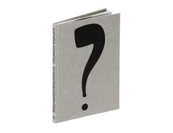
“Melancoaly”, “telefoehn” “lottoforecast”: the artist Katrin Sonntag plays with existing words to form new ones; these she then integrates into...
“Melancoaly”, “telefoehn” “lottoforecast”: the artist Katrin Sonntag plays with existing words to form new ones; these she then integrates into the absurdist text-and-image creations presented in this exhibition catalogue.
The works revolve around the relationship between signs and meanings, be they linguistic or visual. Their key artistic principle might best be described as “associative mutation” and the cover itself offers a typical example. Its canvas-like cloth is stamped with a large black question mark. The typographically inclined will be tempted to try and identify the typeface from the mark’s calligraphic lines, but, in fact, what we’re looking at is a silhouetted take on a famous painting by Magritte – This Is Not A Pipe. Which is true enough here. But then neither is this merely a question mark; in fact, it’s an artwork entitled Die denkende Pfeife (“The Thinking Pipe”).
The catalogue is made up of three booklets. The first contains essays; the more substantial second booklet presents the artworks, reproduced on matt art paper; while the third, printed on glossy paper, takes us on a tour of the exhibition itself. Here, full-page photographs show how their gallery installation further intensifies these mash-ups of image and meaning.
Each of the three booklets is held together by a lock-stitch binding, the threads of which also go through the shared yellow cover. As a result, a narrow strip of yellow is visible between the booklets. So captivating is this elegant solution that you hardly notice its technical complexity.
- Publisher:
- ISBN:
- 978-3-903796-89-8
- Author:
- Robin Byland, Kathrin Sonntag, Dorothea Zwirner
- Pages:
- 120
- Price:
- € 36.00
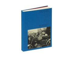
“In our diverse endeavours to develop a design environment, we should also consider the traces left by usage and consumption,”...
“In our diverse endeavours to develop a design environment, we should also consider the traces left by usage and consumption,” wrote Karl Clauss Dietel, whose work this monograph celebrates. From the 1960s on, Dietel was one of East Germany’s leading designers of cars, motorcycles and electrical appliances.
The front and back of the book bear glued-on cover papers, the former featuring a photograph and the latter the blurb. In each case, the pale-yellow paper nestles within a pre-stamped depression that’s just deep enough to ensure the edges don’t catch when the book is returned to the shelf. The bold red of the end papers highlights their role as a flexible link between book block and case. Picture plates printed on glossy white art paper alternate with pale-yellow pages featuring a two-column type area that pushes as close to the page edges as possible, while maintaining a safe margin at the gutter. Only the right-hand column is used for body matter. Other contrasts be-sides the differing paper types quickly become apparent, be it between generous white space and compact typesetting, the serif type and the lightweight, widely spaced sans serif minuscules of the all lower case lines, or the yellow pages and the pale-blue used for Dietel’s original writings, in which he outlines his own theoretical design principles. Also worth noting, if only because it doesn’t shout about its modest function: the pale-grey head-band doubles as a dust excluder for the hollow spine.
- ISBN:
- 978-3-95905-366-2
- Author:
- Frédéric Bußmann, Kunstsammlung Chemnitz
- Pages:
- 422
- Price:
- € 42.00
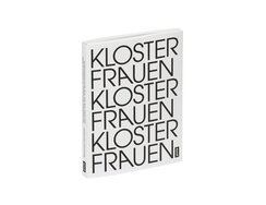
“Life eventually has to end, and whether I write another 20 or 30 emails won’t change that.” ...
“Life eventually has to end, and whether I write another 20 or 30 emails won’t change that.”
Expressed by former Benedictine abbess Sister Carmen, also a professor of sociology, these sentiments reflect surprisingly earthly concerns.
But then what do nuns do? Just repeat the Rosary all day long? This study sheds light on the lives of Benedictine sisters, on their prayer and their work. The impactful cover typography repeats the words “Kloster” and “Frauen” so that they can be read either way – as “Klosterfrauen” (meaning nuns) or “Frauenkloster” (meaning nunnery). The ten-sided cover folds out to form a non-linear table of contents. Approachable portraits show the nuns looking out at us with open expressions, while the women answer fundamental questions in equally open fashion. Alternating with rare glimpses of the convent interiors, their responses give us a remarkable insight into the social and economic reality of convent life in Germany, where these self-supporting all-female entities are many times more numerous than their male counterparts.
The book design also features an audacious combination of opposing type styles: the letters of the body type thus display numerous decorative details and wouldn’t look out of place on a meditation calendar. But the contrast between them and the upper-case chapter headings could hardly be greater, the latter being set as solid matter to create grid-like structures. The font is “Avant Garde”, and one of the chapters is entitled “Gehorchen und Rebellieren” (“Obedience and Rebellion”). Sister Carmen again: “It’s about creating space. A space in which I do nothing but pray. That in itself is a subversive act.”
- ISBN:
- 978-3-86859-606-9
- Author:
- Jutta Görlich, Ulrike Rose
- Pages:
- 176
- Price:
- € 32.00
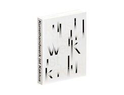
“Applied art is planned serendipity.” ...
“Applied art is planned serendipity.”
Published alongside an exhibition revisiting its own collections, this catalogue from Frankfurt’s Museum Angewandte Kunst is an appreciation of applied art since 1945.
Its heavy book block is made up of three different types of paper. First, you flick through wafer-thin pages as though passing through curtains, taking in the sparingly typeset and cleverly designed title page, whose transparent paper allows us to see the laterally reversed lines on the other side. Then comes a series of expansive views of the exhibition, followed by essays printed on book paper that introduce the exhibition’s concept. Next up is an extensive presentation of the various exhibits on satin-matt art paper – the meat of the book. Here, each left-hand page features a short text about the artist, accompanied by a thumbnail image, the object label and the exhibit’s inventory number; on the opposite page is an eye-catching full-page view of the piece, brought closer via heavy cropping, almost to within touching distance. This gives each spread a high degree of visual tension, allowing the viewer to look beyond what the physical objects stand for and simply revel in their forms, colours, textures, and materialities.
A pair of salad servers from 1952 is particularly striking. With their elongated twin prongs, are they perhaps the inspiration for the cryptic cactus of exhibition title and cover design?
- Publisher:
- ISBN:
- 978-3-89790-649-5
- Author:
- Nora von Achenbach, Ellen Maurer-Zilioli, Christianne Weber-Stöber u.a.
- Pages:
- 588
- Price:
- € 48.00
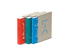
“I admire people who don’t just come across left-handed snail shells, but also recognise that these are exceptional.” ...
“I admire people who don’t just come across left-handed snail shells, but also recognise that these are exceptional.”
Here we have a series of autobiographies by chemists with impressive research and teaching achievements to their name. A daunting prospect for those of us whose school chemistry is but a distant memory, but their design at least is eminently accessible. Each of the three volumes comes in a slipcase – of unlaminated, rustic-looking cardboard no less. If we had the space and time, we could go on at length about the sophisticated die-cutting of the thick grey board, but we’ll spare you. At any rate, the recurring use of cardboard calls to mind the kind of temporary bindings once applied to loose academic papers by local bookbinders. Here, though, the makeshift has been made permanent, resulting in naked cardboard bindings that resemble what you might call half cloth bindings without the cloth.
The duotone printing allows emphasis to be added to particularly notable statements – instead of using irksome infoboxes. The spot colour also serves to differentiate the images, be they diagrams or anecdotal photographs, and lends photos in particular an iridescent charm, allowing scenes to be reproduced in monochrome or duotone and – ingeniously – even in rainbow-print style.
The success of these books lies in the way they blend scientific career retrospective with personal memoir. After all, as Georg Christoph Lichtenberg once wrote: “He who understands nothing but chemistry cannot fully understand even that.”
- Publisher:
- ISBN:
- 978-3-86225-125-4
- Author:
- Günther Maier u.a.
- Pages:
- 312
- Price:
- € 39.80
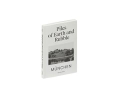
“A. nods silently, hoping to find a shell casing, or even better a steel helmet.” ...
“A. nods silently, hoping to find a shell casing, or even better a steel helmet.”
In Munich, there is a hill that was built after World War Two from the rubble of the ravaged city. In Gyeongju, once the capital of the old Korean kingdom, there are numerous hill-like burial mounds that stand as high as houses.
The visual similarity between these artificial landscapes inspired the author to investigate them in photographs. Her book approaches the subject from both sides, which is why there is no front and no back, just exterior and interior. It circles around these strange places and captures conversations with the photographer’s companions. The story here lies somewhere in the poetic black-and-white images, while the text’s role is to illustrate the street photography. Some of the images are presented in landscape format and rotated so as to discourage you from flicking through too fast. Jumping from one idea to another, the book takes you on an imaginary journey in which storied past and constructed reality are interwoven – Korea’s royal burial mounds now form part of a World Heritage-listed tourist attraction; Munich’s rubble hill has been integrated into its Olympic Park.
The centre of the book (the inside of the mound?) offers up a particularly magical moment, courtesy of a photo that blurs the line between mound and lake, reality and reflection, above and below. They may conceal different things – here, the ruins of an overmighty empire, there the gold of kings – but what these mounds have in common is that they all bear witness to downfall.
- ISBN:
- 978-3-95905-440-9
- Author:
- Ina Kwon
- Pages:
- 200
- Price:
- € 28.00
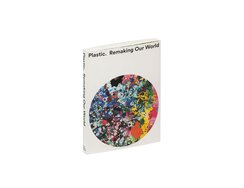
“All wrapped up in Ethocel” goes the slogan of one ad from 1938, a message that nowadays would surely never...
“All wrapped up in Ethocel” goes the slogan of one ad from 1938, a message that nowadays would surely never even get pitched. The accompanying visual shows the Blue Planet set against a backdrop of starry deep space and fully enveloped in plastic film.
It’s just one of the ads presented in this exhibition catalogue’s historical images chapter. The book itself comes wrapped in an attractive cover on which a patchwork colour disc offers an apt visual translation of the exhibition title. That the colour patches are stamped into the rough cardstock further enhances the already highly tactile feel. A didactic illustration spread across the flaps and the second, inner cover, also made of cardstock, provides the key to that multicoloured disc, identifying each colour as a particular type of plastic. Among the 48 exhibits featured in the “Objects” chapter, we find an ornate plastic bell pull made of animal’s blood (1898), the acrylic cockpit canopy of a fighter plane (1945) and a surgical implant made of embroidered polyester (2004). At the end of the chapter, a mycelium building block links to the next chapter’s interviews.
Rather than taking an investigative approach, the exhibition and its catalogue offer a socio-cultural perspective, illuminating aesthetic aspects in order to provide insights about the consumers who are, after all, also partly responsible for this worldwide scourge. The final chapter, entitled “Plastic Data”, visualises the global significance of plastics via simple but dramatic graphics.
- Publisher:
- ISBN:
- 978-3-945852-47-7
- Author:
- Susan Freinkel, Mark Miodownik, Nanjala Nyabola u.a.
- Pages:
- 256
- Price:
- € 49.90
Contact
Phone: +49 (0)69 1306-840
Fax: +49 (0)69 1306-17840
info@stiftung-buchkunst.de
