The Best German Book Design 2021
These outstanding examples of design, concept and finishing are selected for the award by an independent jury.
Single title
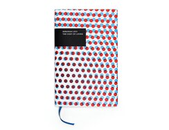
On the book jacket, two dot matrixes are rotated slightly and overlaid. The size of the dots allows us to...
On the book jacket, two dot matrixes are rotated slightly and overlaid. The size of the dots allows us to perceive a third colour in the overlaps and observe the resulting spatial effect. The title plate of solid black looks almost stuck on to the jacket, and one does indeed seem to sit a little higher than the other – but the opposite way round from what you’d expect, with the black plate in fact stamped lightly into the paper. All very curious.
Plate and dots were applied to the cover paper on a proofpress. For their part, the inside pages were printed using polymer blocks on a historic “high-speed” cylinder press (actually ten times slower than offset printing). They feature running heads accentuated by a red spot colour plus chapter dividers that are printed all in red, thus adding a pattern of red stripes to the book block’s edges.
The typography follows tried-and-tested parameters that have evolved over centuries. Dimensions: easy to hold in one hand. Page format: as per the golden ratio. Line length: 55 to 60 characters. Type size: readable at 30 cm. Characters per page: approx. 1,700. Typeface: Caslon, one of the great typefaces of the 18th century (old saying among typesetters: When in doubt, set it in Caslon). Paper: Werkdruck, in yellowish white to avoid dazzle.
The book is supplied in an anthracite-coloured telescope box made from smooth paper, meaning this tribute to the glory of old printing techniques comes archive-ready.
- Publisher:
- ISBN:
- 978-3-949164-00-2
- Author:
- Deborah Levy
- Illustrator:
- Erik Spiekermann
- Pages:
- 998
- Price:
- € 138.00
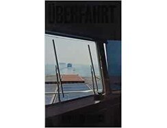
Two artists travel from Hamburg to China by container ship, the only passengers onboard. Afterwards, they produce this book documenting...
Two artists travel from Hamburg to China by container ship, the only passengers onboard. Afterwards, they produce this book documenting their journey.
That documentation takes place on three levels. First, there are text chapters printed on a pleasingly matt off-white paper, set as ragged matter in a modern transitional typeface of generous point size. Each chapter is then followed by a short selection of quotes from a bibliography dubbed the “onboard library”; these are printed in a narrow bold sans serif face on all-grey pages, their display type emphasising the sculptural quality of the letters. (As an aside: there is a throbbing, oily atmosphere to these pages, a suggestion of sea spray mixing with engine smells.) The third level is the journey as seen through a lens, with images printed on smooth, satin paper featuring what must have been an extremely narrow margin for the binders. The change in paper type – visible from the cut edges of the book block – thus signifies a change in level.
The sewn book block is cased in so as to create a hollow spine, ensuring the latter doesn’t break. The cover is laminated with a clear plastic film – a metaphor for the thin membrane between people and elements out on the high seas – into which the black title letters are imprinted, positioned to sit precisely over the black area of the cover photo. All of which makes us grateful we’re no longer limited to preview lists of publishers’ new titles.
- ISBN:
- 978-3-95905-369-3
- Author:
- Roman Ehrlich (Text)
- Illustrator:
- Michael Disqué (Fotografie)
- Pages:
- 320
- Price:
- € 22.00
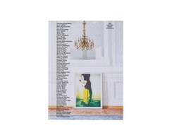
To celebrate its 130th birthday, banking firm Julius Bär has published this catalogue presenting selected contemporary artworks from its own...
To celebrate its 130th birthday, banking firm Julius Bär has published this catalogue presenting selected contemporary artworks from its own collection.
The cover gives a sense of the size of that collection, with a long list of artists’ names, alphabetically arranged, running in two narrow columns down the front and back – aligned left at the left edge on the former and aligned right at the right edge on the latter. Resembling the opening and final credits of a film, they are superimposed over an elegant interior – like in movie dialogues, the photographer gives us a front and reverse shot (by turning 180 degrees) in order to capture the full depth of the space. In each shot, we see edges of the same carpet on the parquet floor.
Brief essays introduces the artists, with a separate page for each. These are followed by accurately reproduced and stunningly printed artworks. The works themselves are not hung in apartments or museums, nor stored in archives. Instead, in line with the firm’s philosophy of bringing art to the workplace, they are displayed in its own premises – and these interiors also feature here, presented in two sets of photographs printed on semi-gloss paper.
The cloth-bound exterior offers a refined, understated look, thanks not least to cover boards cut to sit flush with the book block. Thanks to the absence of projecting edges and jacket flaps, the black edges of the dyed boards remain visible, forming a linear frame around the page block and making this a most elegant physical object.
- Publisher:
- ISBN:
- 978-3-85881-694-8
- Author:
- Barbara Staubli, Barbara Hatebur
- Pages:
- 404
- Format:
- 22 x 29 cm
- Price:
- € 97.00
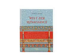
The Renaissance: it’s an era that came to be recognised as the end of the Middle Ages and the beginning...
The Renaissance: it’s an era that came to be recognised as the end of the Middle Ages and the beginning of the early modern age – an epochal shift to which 15th-century Italian literature bore witness, with handwritten books on their way out as printed typography took hold.
This anthology of the genre comes clad in an opulently designed cover, across whose fabric are emblazoned acanthus and oak leaf arabesques in two sky-blue hues. They reference the ornately engraved covers of early printed books, which is why the binding is designed to ensure the repeating pattern is merely cleverly interrupted and not deformed by the joints. In combination with red-embossed upper-case title letters and the generous belly wrapper, they bring sumptuous colour to the cover.
The text’s basic structure and details – red highlight colour, drop caps, centred page titles and chapter beginnings – can be read as a homage to the heyday of early printed books. The choice of typefaces in particular nods to this era, when roman and italics were still treated as separate typefaces and not as members of the same family. Nowadays, Poliphilus, the upright roman type created by Aldus Manutius of Venice, and Blado, the italic type by Antonio Blado of Rome, are available as a pair.
One striking feature of this typographical interpretation is not immediately apparent and thus deserves special mention: the columns at the end of each accompanying text have a taper, the last paragraphs ending with the body matter shaped into individual forms – from pointed to curving to semicircular.
- Publisher:
- ISBN:
- 978-3-86971-205-5
- Author:
- Tobias Roth
- Pages:
- 640
- Format:
- 22,8 × 30,5 cm
- Price:
- € 89.00

Industrialised food production is a controversial subject these days, especially as regards animal welfare, with strong feelings on all sides....
Industrialised food production is a controversial subject these days, especially as regards animal welfare, with strong feelings on all sides. To launch a children’s book posing the question “Where does our food come from?” is thus almost a political act.
The cover title of this slim, large-format book can be read as a cartoon, its image of a child reaching into the fridge providing a light-hearted answer to the title’s more serious question. Perusing the provisions within, we find a fairly standard assortment in which neither junk food nor vegan fare predominates. This is an early indication of the dispassionate stance of the artist and author, who, instead of offering polarised characterisations of artisanal ideal versus industrial nightmare or of organic versus chemical, juxtaposes small-scale and large-scale food businesses on opposite halves of each double-page spread. As though looking through glass walls, we gain glimpses inside the various buildings and insights into the operations within. Whether she’s explaining a fish farm or a slaughterhouse, the author’s tone is always descriptive rather than moralising.
On one left-hand page, we see the activity at a baker’s in the small hours of the morning. In the industrial bakery on the opposite page, meanwhile, our eye is drawn to a spiral chiller that illustrates the difference in scale compared with the traditional bakery. Throughout, illustrative and informative
elements intermix, pastel-hued colour blocks underline the spatial quality of objects and buildings, and the didactic scope, both of the concept and the individual compositions, attests to the extensive research that went into the book’s making.
- Publisher:
- ISBN:
- 978-3-407-75816-3
- Author:
- Julia Dürr
- Pages:
- 40
- Format:
- 26 x 36 cm
- Price:
- € 14.95
