The Best German Book Design 2020
These outstanding examples of design, concept and finishing are selected for the award by an independent jury.
Single title
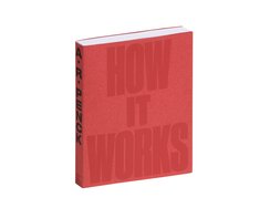
It’s a weighty tome, this exhibition catalogue, but the 500-page volume bends easily when flexed. Six scores in the unprinted...
It’s a weighty tome, this exhibition catalogue, but the 500-page volume bends easily when flexed. Six scores in the unprinted grey cardstock of the inner cover facilitate OTA binding, with the jointed book block cased in at the sides. The resulting hollow spine stops the pages from being pushed outwards after brief usage, and prevents unsightly cracking in the spine — twice over given the second, folded wrapper that’s glued to the spine of the first, creating an outer cover with French flaps.
In the cover title, a shrunken “IT” allows the “HOW” and “WORKS” to be as large as possible. The ultranarrow, extrabold type could easily have rendered the lettering overly monumental — had it not been printed in a chalky dark red that attenuates the contrast, making it look as though the letters have been scooped out of the dyed red paper, which is textured with white microfibres.
An art paper frontispiece, reprinted across multiple pages, precedes the table of contents, whose dual structure reflects the differentiation between essays, printed on lightweight paper in various colours, and picture sequences, which are printed on smooth, matt paper and numbered using Roman numerals that correspond with the relevant exhibition spaces. In between are ultrathin translucent leaves embellished with the painter’s spontaneous drawings. Just beautifully, and we could easily fill three times as much space discussing its design.
- Publisher:
- ISBN:
- 978-3-96098-789-5
- Author:
- Danièle Cohn, Eddy Devolder, Ulf Jensen, u.a., Hans Janssen (Kurator)
- Pages:
- 500
- Format:
- 24 x 30 cm
- Price:
- € 49.80

In this monograph for architectural practice Adrian Streich Architekten, residential buildings feature particularly heavily. The page sequence for each individual...
In this monograph for architectural practice Adrian Streich Architekten, residential buildings feature particularly heavily. The page sequence for each individual project echoes the development process: first comes an (almost) empty sheet, then an introductory page, then a summary with facts and figures, then informative plan pages, then ensembles of project photographs, then a final double page featuring a striking exterior shot of the end result.
With their immediacy, these impressive spreads convey the care that went into architecture, photographs and book design alike. Not forgetting the printing: here, images leap out from the matt paper thanks to precise halftoning, their every detail remaining clearly visible even in shaded areas. Sober yet atmospheric, pragmatic yet elegant, as concerned with materiality as with spatial presentation, the pages invite you to peruse and study the practice’s ideas — practically an invitation to industrial espionage.
One subtle detail typifies the way its design always considers the reader: in order to avoid competing with the various kinds of numeration already visible in the footer (pagination, year of completion, catalogue reference), the captions are not numbered but instead lettered in alphabetical order.
Almost incidentally, the chromatic trinity of the outer elements — rough sandy cover paper, dark-brown end papers, greyish blue backgrounds for the opening and closing pages — add associations of stone, earth, wood, glass, metal and air.
- Publisher:
- ISBN:
- 978-3-03860-135-7
- Author:
- Axel Simon, André Bideau, Adrian Streich
- Pages:
- 452
- Format:
- 23,5 x 31 cm
- Price:
- € 77.00

Intended as a showcase for the work of Team V Architectuur, this publication is more than just a portfolio of...
Intended as a showcase for the work of Team V Architectuur, this publication is more than just a portfolio of the practice’s projects, with musings on architectural and urban planning processes lending it a manifesto like character.
That character is clear right from the foldout cover, which places more emphasis on the book’s prosaic motto than on the practice’s name, having the former stamped in white foil and the latter printed in pale grey. The background for both comes courtesy of refined, medium-grey Cardstock whose grained texture lends it a leathery look. Next up is an inner wrapper that protects the book block; this time the material is pale-brown uncoated cardstock with a lively, fibrous structure. The two covers are glued together at the spine and provide a soft feel that comes as a surprise given the book’s hefty size and weight, not to mention the imposing buildings that are its subject.
A change from matt to gloss coated paper marks the transition from the architectural criticism of the introduction to the presentation of the built work. As does the introduction of a warm grey special colour, be it in duplex images lent brilliance by frequency modulated halftoning, in differentiated typefaces and in pale grey spreads that serves as backdrops for intricate building plans.
Nothing is accidental. Providing as little distraction as possible, subtle typographical navigation aids are set on the edge of the footer and outer margins, while the grey the me continues right into the visible centre of the bound sections. Elaborate understatement — that’s the watchword here.
- Publisher:
- ISBN:
- 978-3-7757-4591-8
- Author:
- Hans Ibelings
- Pages:
- 288
- Format:
- 24 x 32 cm
- Price:
- € 58.00
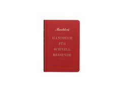
A copyright notice in tiny type, contents lines in giant letters, chapter preambles in loosely spaced yet solid set type...
A copyright notice in tiny type, contents lines in giant letters, chapter preambles in loosely spaced yet solid set type — all in a sextodecimo format that’s ideal for frockcoat pockets. Wait, what?
Back in 1835, a new edition of Baedeker’s Handbuch für Schnellreisende set the template for modern travel guides (the titular “Schnellreisende” or “fast travellers” refer red here to passengers on Rhine valley river steamers). Inside the handily sized book, which featured a bright red cover with rounded corners, tourists could find route details, precise measurements in paces, information on places to stay and eat, as well as on the area and its people and, above all, on key sights to see — though it was of course the guide itself that made them such. This present-day edition is similarly compact, but comes with updated design details.
In this case, fast travel can be taken literally: without so much as leaving our homes, we can be instantly transported to a range of destinations from the first 100 years of the Baedeker guide. The typesetting takes its cue from a then widely used modern typeface — the 19thcentury version of Times, as it were — while the illustrations combine elements of old engravings to create enchanting and surreal collages. Remarkably, these visuals, like the typography, are airily arranged yet full of interest, thereby echoing the anthological approach.
Gloriously, all page edges are in neon pink — not something you’d expect from an otherwise antiquarian-style book. It’s a bibliophilic, ironic self-reference on the part of the publishers, designed to lift the spirits of culture vultures and sensation seekers alike.
- ISBN:
- 978-3-7701-6686-2
- Author:
- Christian Koch, Philip Laubach-Kiani, Rainer Eisenschmid u.a.
- Pages:
- 384
- Format:
- 10 x 15 cm
- Price:
- € 17.95

That lower case “g” — typomaniacs could spend an hour just poring over this one letter, which is from the...
That lower case “g” — typomaniacs could spend an hour just poring over this one letter, which is from the SangBleu Kingdom family, the main typographic tool for this catalogue for an exhibition marking 250 years of Ludwig van Beethoven. It’s a type style that draws on the dynamic line weight of a transitional Antiqua but has bowls featuring vertical axes, while the serifs extend almost linearly à la classical Antiqua typefaces. That places it (if categories are, for clarity’s sake, required) squarely in the middle of the stylistic shift from transitionals to the ultramodern.
There’s not one line of black type in this lavishly illustrated volume. The beginnings of each chapter feature colour-block backgrounds, and the ensuing chapter text is printed in a matching hue on sturdy, smooth matt paper. Inserted amongst the pages are individual smaller format leaves featuring backgrounds in that same chapter colour, an impressive feat given the switch here to glossy paper that must have made accurate colour matching a challenge.
Similarly impressive is the arrangement of text and images. In single-column variants of the type area, footnotes and captions are set alongside the content to which they refer, being printed in a marginal column that extends out of the gutter. The book block is sandwiched between sturdy cover boards, with the open spine revealing stripes of colour from the enclosed gloss pages.
“g” as in greatness, or: audacity meets virtuosity — that would be the synopsis for this masterfully designed book.
- Publisher:
- ISBN:
- 978-3-86832-555-3
- Author:
- Silke Bettermann, Otto Biba, Ingrid Bodsch u.a., Beethoven-Haus Bonn, Kunst- und Ausstellungshalle der Bundesrepublik Deutschland, Bonn (Hrsg.)
- Pages:
- 264
- Format:
- 24 x 30,5 cm
- Price:
- € 39.80
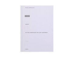
A rectangle of stamped silver foil bearing the title graces this book’s simple cover, which is rendered in matt white...
A rectangle of stamped silver foil bearing the title graces this book’s simple cover, which is rendered in matt white paper that is otherwise uncoated. Inside, the 72 pages of this slender board-backed volume are positively spartan, featuring plain paper and simple monochrome digital printing.
They contain just one long poem. Its free verse is reverse printed, the white lines set within left-aligned black blocks that rather call to mind the black censor bars of redacted text. These blocks are positioned at seemingly random intervals, occasionally narrowly but mostly widely spaced. In between: wide expanses of white — space for what’s left unsaid? Or for contemplative pauses?
Preceding and upcoming lines are glimpsed through the paper — a simultaneous echoing and foreshadowing perhaps. In the poem, the author reflects on her role within the family, which emigrated to Sweden from Iran. The pronouncements of mother, father, brother, uncle and grandmother whirl around her — and the untold family story unfolds gradually between the lines, the brother, for instance, declaring: “The past is an assault never to be completed.”
With colons the only form of punctuation, the typography seems to present the poem in stage-play format, as a kind of performative direction such as one might find in theatre scripts. Its genius lies in the way it visualises a narrative paradox: the entire poem turns out to be one long self-reflective monologue in which the speaker’s own voice goes unheard.
- Publisher:
- ISBN:
- 978-3-937445-99-1
- Author:
- Athena Farrokhzad
- Pages:
- 72
- Format:
- 17 x 24 cm
- Price:
- € 19.90

A wordless introduction: not a single line graces the front cover of this weighty tome, which deals with the no...
A wordless introduction: not a single line graces the front cover of this weighty tome, which deals with the no less weighty subject of Germany’s reunification in 1990. Instead, two photographs serve as a metaphor for the entire book. One shows a worm’s eye view of six people looking in various directions, their faces etched with concern. “Looking into the abyss of freedom” it says somewhere within. Below is a building-lined street, in the middle of which chunks of broken road surface jostle like ice floes. Inside, we find another photo showing the sorted remnants of an antique vase, to which the caption reads: “Fragments after cleaning, before assembly”.
Over the course of the book’s 592 pages, finds are similarly sorted and arrayed: carefully researched photographs, mostly in black and white; quotes, essays and interviews in the last century’s most neutral typefaces. Type sizes vary within the two- and three-column type area. Individual sentences are displayed like subheadings, and single words rendered like headlines. Text blocks and images are separated by thick lines, creating a layout that calls to mind newspaper pages — or perhaps death notices, given how millions felt their own biographies were slowly laid to rest along with that of the defunct state. Furthermore, they make the pages seem like type cases with which whole new histories might be written — the histories of those we have collectively forgotten. To read this book then is to delve into a treasury of memories.
- ISBN:
- 978-3-95905-319-8
- Author:
- Martin Gross, Alexander Kluge, u.a., Jan Wenzel, Anne König, Andreas Rost, u.a. (Hrsg.)
- Pages:
- 592
- Format:
- 24,3 x 33,5 cm
- Price:
- € 36.00

It’s worth fully opening up the book’s cover — French Flaps mean there’s no risk of damaging the binding —...
It’s worth fully opening up the book’s cover — French Flaps mean there’s no risk of damaging the binding — in order to better untangle its melange of colour blocks, photographs and texts, which are overlaid like a series of transparencies.
This publication accompanies a pair of exhibitions at Dresden’s Albertinum art museum, in which contemporary artists carried out onsite interventions, subverting the seating in front of paintings, the lights hanging from gallery ceilings and the plinths supporting works of sculpture. In doing so, they were referencing work by Mondrian and Lissitzky, who in 1926 created exhibition designs that broke with the conventions of museum-based art presentation.
This book, too, shakes things up. The interplay between various different exhibition aspects, for instance, is echoed by the combination of seven different paper types: the two covers use coated gloss and brown kraft cardstock, the latter coated white on one side; the contents page paper is high-gloss cast-coated on one side, then there’s uncoated matt paper in grey, white and unbleached and finally a silk-matt coated paper. Eight special colours, meanwhile, lend vibrant emphasis to photo spreads documenting various Dresden exhibitions from the past. One of the featured images shows a museum space, repurposed via studio lighting, in which a photographer has affixed a colour scale to a picture frame and is now holding his light meter up to the painting. It’s precisely this image that was chosen for the front cover.
- ISBN:
- 978-3-95905-352-5
- Author:
- Isabelle Busch, Kathleen Reinhardt, Hilke Wagner
- Pages:
- 144
- Format:
- 16 x 32 cm
- Price:
- € 28.00

We meet a discerning gentleman — tie, waistcoat, pinstripe trousers — who thinks he owns the world. Fausto, though, wants...
We meet a discerning gentleman — tie, waistcoat, pinstripe trousers — who thinks he owns the world. Fausto, though, wants to make sure. “You are mine”, he says to a humble flower, words that appear in large, somewhat eroded lead letters. The following double page reveals this statement was, in fact, a threat: the round, neon-red lower now adorns Fausto’s breast pocket, with only its severed stem remaining in the ground.
Printed on sturdy matt paper, the illustrations, reproduced from original lithographs, are rendered in monochrome browns accented with neon shades — be it for the flower or twilit mountain or for added emotionality, as with the protagonist’s rage at being defied by the objects of his avaricious desire. The pictorial compositions are so pared down they leave acres of white space, creating an air of veiled tension. Their very design can thus be read as an answer to the question: how much is enough? Unfortunately, the fact that such open expanses offer space for relationships and not just objects is something Fausto will never learn.
- Publisher:
- ISBN:
- 978-3-314-10523-4
- Author:
- Oliver Jeffers
- Pages:
- 96
- Format:
- 17,8 x 25 cm
- Price:
- € 18.00
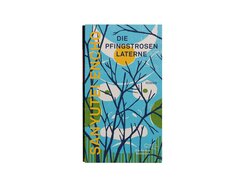
Sliding this book from its cover, you’re immediately struck by the way its design wraps around, with all six sides...
Sliding this book from its cover, you’re immediately struck by the way its design wraps around, with all six sides of the slipcase given equal care and attention — even the top and underside — and incorporated into the cover design. Open at both ends, the slipcase gives a glimpse not only of the book’s spine but also of its foredge, whose lineation, defined by full-bleed colour pages, promises a richly illustrated interior.
Gracing the slipcase is a traditional Japanese-style woodcut that exhibits the duality of flatness and depth so typical of the technique. A further woodcut adorns the book cover itself, with the title of the book appearing only on the glossy, bloodred spine labels, which are echoed by a red headband and bookmark ribbon.
The story, a classic Japanese spine-chiller, is printed in two different blues — a darker shade for the elegant, narrow blocks of text and a lighter one for the page numbers and the first three words of every chapter. The 22 chapters are each prefaced by a full-bleed page whose colour gradation shifts gradually upwards over the course of the story, meaning the pages get lighter and lighter as you approach its end.
These contrasts — between light and dark and between asymmetric, stylised forms — lend the page compositions a truly intriguing look.
- Publisher:
- ISBN:
- 978-3-8477-0418-8
- Author:
- Sanyutei Encho
- Pages:
- 336
- Format:
- 12,1 x 21,3 cm
- Price:
- € 44.00

What do German bookworms do on their break? Pour themselves a glass of red, perhaps, and riffle through the Wunderkammer...
What do German bookworms do on their break? Pour themselves a glass of red, perhaps, and riffle through the Wunderkammer der deutschen Sprache, a treasure trove of linguistic gems, curiosities, everyday verse and stories from the German language’s past.
Dispensing with a table of contents, the book, printed in quarto format, instead lets you dive in wherever you want, opening easily, almost by itself, at a given page. Inside, diverse typographic forms burst forth from its pages. The workhorse among them is a classical Antiqua typeface, the type style which, in Enlightenment times, was considered the most upstanding the “black art” had to offer, while the book’s passion for its subject matter is reflected in its frequent use of orange-red as an accent colour, a pleasing contrast to the primary bluish anthracite hue. The often centred headlines, meanwhile, feature markedly spaced capital letters, all conceivable forms of text alignment and, of course, two-colour printing.
The typesetting uses different sizes and weights to reflect different semantic situations, with the many kinds of text meaning much work for the typographers; there are essays, enumerations, tables, lists, diagrams and categories, all of which demand appropriate treatment. Comprising mostly two but also one and where necessary even three columns, the varying type area, meanwhile, makes for individual looking double-page spreads.
In this compendium of linguistic history, there’s surely something for every bookworm to discover.
- Publisher:
- ISBN:
- 978-3-946990-31-4
- Author:
- Thomas Böhm , Carsten Pfeiffer
- Pages:
- 304
- Format:
- 15,5 x 23,5 cm
- Price:
- € 28.00
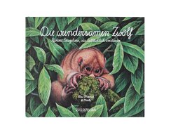
The magic of this book’s mysterious cover lies in the way it combines the art of illustration and the craft...
The magic of this book’s mysterious cover lies in the way it combines the art of illustration and the craft of printing. Showing a saucer-eyed, shorthaired little creature peering out from dense jungle foliage, its meticulously drawn, centrally composed image is reproduced in minute detail via careful digitisation and precise halftone printing.
Reverse printed in white, the title lines are rendered in a calm, even cursive that calls to mind chalkboard writing. The same goes for the back cover blurb, which is displayed on a semi-transparent rectangle tucked into the leaves.
Inside, a front endpaper in verdant green bears the table of contents, while the following twelve sewn-bound double pages, made of matt cardstock paper, present some of the world’s strangest mammals. The righthand pages feature depictions of the animals in the wild — rather like telephoto closeups of each habitat. The illustrations are drawn in the same enchanting, naturalistic style as the cover image and have rounded corners suggestive of a spotter’s lenses. The opposite pages contain observational reports on each animal — for which the aforementioned hand-written style is perfectly suited. Each paragraph is accompanied by a black-and-white drawing depicting the animal in a different position, in detail view or engaged in some everyday pursuit.
Black-and-white pages opposite colour pages, ample white space, compact richly shaded images, cursive script and tactile paper — all this adds up to a clear, pared-back design with intriguing visual contrasts.
- Publisher:
- ISBN:
- 978-3-96348-006-5
- Author:
- Rae Mariz
- Pages:
- 32
- Format:
- 20 x 24 cm
- Price:
- € 16.00
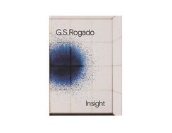
The front matter offers an unusual introduction: here, the frontispiece takes the place of the fly title, the inner title...
The front matter offers an unusual introduction: here, the frontispiece takes the place of the fly title, the inner title that of the frontispiece, the dedication that of the inner title, and a double copyright page that of the table of contents. Then comes a pictorial interlude, followed by a double contents page and then the essays, where, as on the previous pages, the two language versions are differentiated via typeface, alignment and position on the page (top half or bottom). An index of works, which you’d normally find at the back of the book, completes the preliminaries, the last pages of which sees a change in paper quality, from recycled grey to pristine white.
Now, after a pause for breath courtesy of an empty double page (not strictly blanks as the pagination continues), we find ourselves in an art space, directly facing the rear uprights of a huge canvas frame. The following, full-bleed pages take us on a gallery tour in which everchanging perspectives illuminate the spatial context of the installation.
A new space, a new series: this time, the paintings are wall-hung and the paper type has changed again — from absorbent matt to coated gloss. The latter allows the viewer to better see how the light reflecting on radial brushstrokes creates concentric waves.
Gatefolds open up, revealing parades of canvases, structures without scale. What are they showing us? Enlargements of microbiological realms? Or reductions of galactic colour bursts?
- Publisher:
- ISBN:
- 978-3-947432-01-1
- Author:
- Giacomo Santiago Rogado, Amanda Haas, Giacomo Santiago Rogado (Hrsg.)
- Pages:
- 217
- Format:
- 23,8 x 32,5 cm
- Price:
- € 45.00

Examining a slice of architectural history, this book illuminates a period in the career of Swiss architect Hans Schmidt, namely...
Examining a slice of architectural history, this book illuminates a period in the career of Swiss architect Hans Schmidt, namely his time working in the Soviet Union.
Bound in stiff paper, the front cover impresses with its visual austerity and precise technical execution. Strong contrasts allow for a wide range of associations: a compact title block in wide, bold sans serif type fills the upper half of the red cover, with the combination of black and dark red foil-stamped lettering on a velvet matt background maximising the variation in gloss.
It’s an exterior that clearly signals the book’s rigorous design approach. Within, the typeface mix — a sculptural yet sober serif type alongside the afore mentioned sans serif — nods to the typography of the modernist avantgarde.
The type area, set high and very close to the front edge of the page, has a blocky look that’s enhanced by the way the footnote section sits right up against the main body — albeit in a significantly smaller size and with deep indents that align with the regular paragraph indents. The result is an interesting back and forth of white space. This is echoed by the blank spaces of the image pages, their photographs, reproduced in facsimile quality via frequency modulated halftoning, being positioned within the same basic grid.
There’s a real freshness here — perhaps it’s simply the timelessness of pre-war modernism, or perhaps it’s testament to good design’s ability to express meaning through form, going beyond mere function to create a kind of a visual language.
- Publisher:
- ISBN:
- 978-3-85881-653-5
- Author:
- Jürg Düblin
- Pages:
- 440
- Format:
- 17 x 24 cm
- Price:
- € 48.00

This personal diary documents 44 days in the life of young Ida and her bunny. Each day has a different...
This personal diary documents 44 days in the life of young Ida and her bunny. Each day has a different motto — “Cleaning Day”, “Sad Day”, “Decision Day” — and takes the form of a comic strip. The action takes place on the righthand pages, in open sequences that eschew conventional panel frames and speech bubbles. The sequence order and reading direction are determined only by the figurative logic of the images.
Graphically, what’s particularly interesting is the way the pen strokes vary in boldness and density, be it in the panels or the hand-drawn block letters, both of which are in a muted cyan blue, although the images, precisely overprinted with an orange-red, appear a shade darker. This secondary print colour also features on its own, namely in Ida’s ponytailed hair.
The rustic style of the pen work is matched by that of the daily headings, in which sans serif letters with a broken bold face jiggle along the baseline, looking like they were individually stamped onto the page. That broken look is echoed by the surface of the full-bleed background opposite. Here, something rather remarkable unfolds almost imperceptibly, on the periphery as it were: every day, a new object wanders over to the left-hand page, which gradually fills up until it resembles a hidden picture puzzle. Not that this is just some metaphor for an individual’s gradual accumulation of stuff; rather, it underlines how things have a meaning that goes beyond the object itself — by virtue of their associated memories.
- Publisher:
- ISBN:
- 978-3-89565-383-4
- Author:
- Antje Damm
- Pages:
- 96
- Format:
- 17 x 24 cm
- Price:
- € 12.00
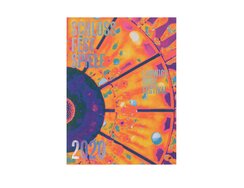
Freshly printed and immediately obsolete? When the catalogue for the Ludwigsburg Festival went to press, no one could have guessed...
Freshly printed and immediately obsolete? When the catalogue for the Ludwigsburg Festival went to press, no one could have guessed that, five weeks later, an epidemic would see the whole country put on hold and public performances banned. All that effort on the part of the organisers, not to mention the artists, for nought! Everything had been meticulously planned — including a festival programme whose design is a work of art in itself.
Its eye-widening image reproduction uses variously manipulated four-colour printing: in quadruplex mode, bold blue, neon pink, neon yellow and black have been spread across the tonal range in such an unorthodox way that the gradation curves positively bend. The ceiling of a baroque dome is thus rendered even more exuberant, baroque and surreal; the countenance of Hille Perl is transformed into a flaming Medusa’s head; a snapshot of a Pina Bausch choreography seems to capture a magmatic eruption; and a copperplate of Bach displays the iridescent coloration of a bird of paradise.
The sewn binding in six different colour threads, meanwhile, is an understated masterstroke. Writing his introduction, Horst Köhler could not have known that his already forceful remarks would soon be lent even greater weight by a nationwide lockdown: “We will have to wave goodbye to some of the everyday conveniences and patterns of consumption we have come to hold dear. But we can also gain from focusing our attention on things that engender real meaning and happiness.”
Let no one say then that music, dance, theatre and literature — not forgetting book design — are not essential industries.
- ISBN:
- 978-3-00-065474-9
- Author:
- Jochen Sandig, Bettina Sluzalek, Raffaela von Salis u.a., Jochen Sandig, Ludwigsburger Schlossfestspiele (Hrsg.)
- Pages:
- 168
- Format:
- 17,5 x 23,5 cm
- Price:
- € 12.00

Newly reissued, this anthology of verse by young expressionist poets made waves even on first publication a century ago, and...
Newly reissued, this anthology of verse by young expressionist poets made waves even on first publication a century ago, and its verbal imagery remains as current as ever. But how does a book designer visualise such enduring appeal without giving in to misty-eyed nostalgia?
Here, the type area of the inside pages is arranged in unspectacular fashion; in other words: the design is subservient to the words. The particularly upright Antiqua typeface lends a quiet, austere, even solemn air, while its script-like italic version features in understated but vibrant running titles.
The sole contrast is provided by the afterword, which is set in semi-bold sans serif and thus marked out as a contemporary addenda to this new edition.
Echoes of the original publication from 1920 can be seen not only in reproduced portraits of the poets by artists such as Kokoschka, Schiele and Meidner, but also in the cover design, which, in type style and line lengths, directly references the typography of the earlier volume’s dust jacket, the only difference being that, here, the full title is printed straight onto book cloth.
Then comes an arresting contrast in materials: around the cloth binding lies a jacket of clear plastic film — printed with broad, irregular splashes of translucent colour that nod to the illustrated cover of the 1959 paperback. The result is a contemporary cover that reflects something of the publication history of this influential book.
- Publisher:
- ISBN:
- 978-3-498-00138-4
- Author:
- Kurt Pinthus
- Pages:
- 448
- Format:
- ,5 x 20,5 cm
- Price:
- € 34.00

Miroloi — song for the dead — tells, in 128 “verses”, the story of a girl discovered as a baby...
Miroloi — song for the dead — tells, in 128 “verses”, the story of a girl discovered as a baby by an archaic village community.
The bibliophilic cover is enigmatic, featuring watercolour gradations in a mysterious inky blue that alternate horizontally with white wave crests. The title’s almost black lettering would be hard to read were it not for the three dimensionality added by the clear light and shade effect of its deeply embossed characters — an emphasis that underlines the haptic qualities of the cover’s grippy textured paper.
In contrast to standard German practice, the vertical spine text reads from top to bottom, making it legible when the book is lying flat on a table (as it is now), though, strangely, only the author’s name features on that broad flat spine, rendered in large, brush-drawn capital letters matching those of the cover title.
But wait: the title Miroloi is printed in the same lettering on the opposite side, though not on the foredge of the inside pages but on thick paper, giving the impression a soft cover has been inserted the wrong way round inside the hard cover.
Not so — open up the latter and you realise that this supposed soft cover is actually part of the back endpaper, extended and wrapped around the foredge. It’s a singular effect: this is a book that can be shelved spine first yet still display its title — on what you might call its front spine.
- Publisher:
- ISBN:
- 978-3-446-26171-6
- Author:
- Karen Köhler
- Pages:
- 464
- Format:
- 12,5 x 20,5 cm
- Price:
- € 24.00

This book’s intriguing design makes use of various paper types. The first — a lightweight, uncoated white paper — bears...
This book’s intriguing design makes use of various paper types. The first — a lightweight, uncoated white paper — bears texts about the South Korean artist’s work. Given the large format, the use of three columns for the three language versions seems the obvious solution, but it’s soon abandoned, with the running copy for each version ignoring the formal boundaries of column breaks and encroaching into the neighbouring column. These around-the-corner columns, to coin a phrase, fit together to form a compact block of type.
Then comes the presentation of the abstract artworks. These are printed on coated but even lighter paper, a material that delivers multisensory experiences: so thin as to be almost transparent, it also generates a fluttering sound during browsing.
These contrasting page types alternate every four pages: two accurately reproduced colour pictures are printed on each of the four-sided folios, which are folded and bound pouch-style so that their foredges remain closed. These are followed in each case by a series of four monochrome pages featuring a poster-format caption and page number, a double-page spread showing the gallery-space context, then another caption. The slightly shorter width of these pages means those thumbing through the book find it only ever opens at the colour works. To access the double-page gallery-space spreads — to gain deeper insights, as it were — a different motor skill is required: here, the reader needs to use forefinger and thumb to grip the pages.
Ingenious — a book whose design even reflects different page-turning methods!
- Publisher:
- ISBN:
- 978-3-96070-041-8
- Author:
- Nam Tchun-Mo (Artist), Olivier Delavallade, Beate Reifenscheid (Text)
- Pages:
- 432
- Format:
- 24 x 32 cm
- Price:
- € 48.00

For readers and browsers alike, this nonfiction children’s book about water offers a hugely varied and ever surprising experience. Featuring...
For readers and browsers alike, this nonfiction children’s book about water offers a hugely varied and ever surprising experience. Featuring an editorial concept based around pictorial double-page spreads, the book dispenses with a table of contents and eschews subsections and info boxes throughout. Text blocks are thoughtfully integrated into the artwork and can be read in one of two ways — either as a continuous narrative or separately as captions. Headings are rendered in a hand-lettered style that balances description with illustration. Judiciously used blue and ochre tones dominate the large format visuals’ distinctive palette. And the vignetting is modulated by coarsely grained gradations, while other elements seem almost disconnected from the here and now. All this creates a vintage look — you feel as if you are perusing one of those kids’ books or primers from your grandparents’ childhood, in which everything was described in such clear and didactic yet also narrative fashion. The matt recycled paper, meanwhile, also plays its part.
The same paper is used for the stimulating cover, around which a maze of pipes and hoses winds its way and on which one subtle detail reveals a deep understanding of the materiality: as the unlaminated cover’s corners are particularly at risk of wear, they feature subtle gradations of sprinkled white dots. These enliven the aqua blue background via a water-bubble effect — and allow any future abrasion of the paper to be subsumed into the design.
- Publisher:
- ISBN:
- 978-3-407-75565-0
- Author:
- Christina Steinlein
- Pages:
- 96
- Format:
- 16,5 x 22 cm
- Price:
- € 14.95
