The Best German Book Design 2020
These outstanding examples of design, concept and finishing are selected for the award by an independent jury.
Single title

It could have been an unassuming thing, this chronicle of the Württembergische Schwesternschaft, a Stuttgart-based nursing organisation that’s part of...
It could have been an unassuming thing, this chronicle of the Württembergische Schwesternschaft, a Stuttgart-based nursing organisation that’s part of the Red Cross network. Qualities such as sympathetic care, selflessness and modesty, the obvious associations here, don’t necessarily lend themselves to showy self-promotion. How, then, does this book come across, a book that is, after all, intended as part of the organisation’s anniversary celebrations?
On the stiff paper cover, we see a nurse looking attentively towards us from amidst the strong black-and-white contrasts of a historical photograph. Printed in large lower case letters from the sober Akzidenz Grotesk typeface, the words “pflegen” and “helfen” are set aligned with the bottom righthand edge, forming the cornerstone, as it were, of the composition. Also visible, in very small type, is the occasion for the publication. The patina in the photograph’s background continues over onto the back cover, where the two parts of the title are repeated but with their type sizes reversed.
The disciplined typography has both functional and intrinsic value. The letters of the san serif typeface, used in starkly differing type sizes, resemble carefully laid out cutlery and fill the narrow type area in left-aligned lines with an even rag. Different zones are used for different kinds of text: notes are set in wide inner margins, quotes are aligned with the running copy’s deep paragraph indents, and short quotes are even set in huge display type on otherwise blank double pages. All this makes for a roomy, confident look.
- ISBN:
- 978-3-00-062432-2
- Author:
- Sebastian Knoll-Jung, Susanne Scheck , Württembergische Schwesternschaft vom Roten Kreuz e. V., Stuttgart
- Pages:
- 342
- Format:
- 17,4 x 25,2 cm
- Price:
- € 29.90

A bowl-shaped valley is planted with vineyards; these are then built over and urbanised — that’s Stuttgart in a nutshell....
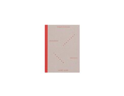
A bowl-shaped valley is planted with vineyards; these are then built over and urbanised — that’s Stuttgart in a nutshell. Today, all that remains of the city’s earlier viticultural infrastructure is some 400plus stairways, an unusual feature to which a pair of artists have dedicated a long-term project, visiting dozens of these stairs.
The result is a two-part publication comprising a book let and a map. The latter comes in a sleeve of plain grey cardstock, while unlaminated grey card also stiffens the former’s red-spined soft cover, both of which are embossed with subtle red lettering. Inside, we find impressions of each staircase in words and pictures, poetic miniatures whose lines are printed in a pleasing and easy-to-read typeface that harks back to commercial prints from the days when not all of Stuttgart’s vineyards had yet been cleared for urban development.
In the numerous minimalistic pencil drawings, the stairways are shown without their surroundings, which allows for all manner of associations: one seems to resemble a monumental stepped temple, another an unassailable Alpine summit, yet another a deep gorge, while one, rather surreally, calls to mind a seaside sunset.
Featuring red binding thread, red intro and outro pages, red page numbers and pedantic cross-reference marks, this bibliophilic publication is a must for any proud local with a penchant for urban walks.
- Publisher:
- ISBN:
- 978-3-9821198-0-9
- Author:
- Christina Schmid, Sabine Fessler
- Pages:
- 200
- Format:
- 11 x 15 cm
- Price:
- € 22.01

The initial impression with this children’s book is one of harmony. The illustration style is apparent right from the eye-catching...
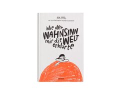
The initial impression with this children’s book is one of harmony. The illustration style is apparent right from the eye-catching cover, where the handwritten title line forms a speech bubble that hovers above a girl’s head and the bold colour is echoed by a matching headband. A matt, slightly yellowish contents page is among the elements that add to the book’s readability. The type area is traditionally organised, featuring the rigid line forms of a serif typeface, generous line spacing, indented paragraphs, centred page numbers and lower first lines for new chapters. Illustrations are boldly drawn and lent particular vibrancy by the way the paper’s rough surface breaks up the chalk shading. The colour scheme is two-tone — with black accented by a muted light red — and the many ways in which the two can be combined are joyfully exploited.
As if all that weren’t enough to make for a beautiful-looking book, it turns out the artwork goes far beyond mere illustration: there are also numerous whole-page, full-bleed pictures, plus images set with the columns of type — from traditional vignettes to associative metaphors — as well as hand-drawn chapter numbers reminiscent of initials. Often the images are incorporated into the text, as in the many instances when the young protagonist makes notes or paints what she’s thinking, while the recipes that form an integral part of the story are another unexpected delight.
- Publisher:
- ISBN:
- 978-3-446-26444-1
- Author:
- Dita Zipfel
- Pages:
- 200
- Format:
- 14 x 21,5 cm
- Price:
- € 15.00

This book is the distillation of an art project dedicated to the cultural history of the lemon and the colour...
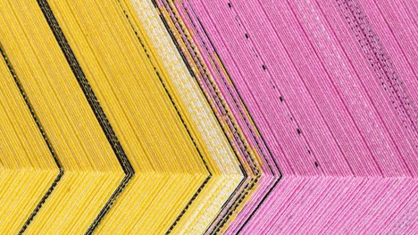
This book is the distillation of an art project dedicated to the cultural history of the lemon and the colour yel low. It documents the aesthetic research of Chinese artist He Xiangyu, complementing it with a collection of expert essays.
The foldout cover offers various vexations: although the title is clearly legible, half the letters seem barely there, being concealed by a grid of narrowly spaced white bars. The half-hidden letters, meanwhile, consist of vertical line fragments.
Even more baffling is the discrepancy between content and print colour — a yellow book with a blue cover? The interior is similarly vexing. The typography nods to the conventions of research publications (uncluttered type area, Garamond for the main typeface) but here, too, there are perplexing details, such as running heads and page numbers that are not in line. Above all, you start to wonder where the artworks are.
Some pages feel thicker than others. In fact, they consist of two leaves featuring a closed front edge in the manner of Japanese bindings. Prise them apart and the resulting pocket reveals prints from the artist’s series of colour studies. The whole book can thus be read as a fruit metaphor — to fully appreciate it, you need to open it up.
Seen in this light, the cover too is an experiment in sensory perception, with the mind’s eye adding a virtual, nonvisible yellow.
- Publisher:
- ISBN:
- 978-3-7757-4537-6
- Author:
- Maryan Abdulkarim, Rosalind Chou, Carl Vadivella Belle, He Xiangyu (Hrsg.), Isaac Chong Wai (Hrsg.), Chen Siran (Hrsg.)
- Pages:
- 334
- Format:
- 15,8 x 23 cm
- Price:
- € 40.01
