
Best German Book Design 2024
Stiftung Buchkunst awards the best german book design of a year, offers a platform for rethinking the medium of the book with the sponsorship prize for young book design, and networks international book design competitions under the umbrella of best book design from all over the world.
Single title
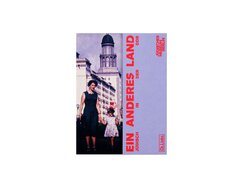
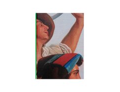
It’s not just the subject matter that immediately arouses our interest here, but the unconventional cover flaps too. The front...
It’s not just the subject matter that immediately arouses our interest here, but the unconventional cover flaps too. The front flap doesn’t fold inwards in the usual way; instead, it folds backwards, or at least outwards. At any rate, when folded, it conceals two-thirds of the cover proper, partially obscuring its visual – that of a mother with daughter and nephew alongside passers-by on Berlin’s Stalinallee.
The chapters of this exhibition catalogue on Jewish life in East Germany start with an image section. Personal photographs, historical documents and objects are then followed by essays in which heavy sans serif type fills almost the entire format. Extremely narrow margins – the page numbers are less than five millimetres from the edge – make for typographically dense pages. Their design uses five different line measures, allowing for variety across the text types and providing a meaningful structure. Texts are always positioned towards the front, i.e. towards the foredge, leaving blank space in the gutter. On one page, for instance, a narrower text block creates space for a marginal column, while the facing page retains the full line length. Elsewhere, the gutter space is widened on both pages just enough to accommodate the chapter heading, which is displayed as a vertically rotated column title. A similar rotation of the image section’s captions helps to focus attention on the photographs themselves.
- Publisher:
- Topic:
- Non-fiction
- ISBN:
- 978-3-96289-207-4
- Illustrator:
- Team Mao / Siyu Mao, Moritz Böhm, Jan Husstedt
- Pages:
- 272
- Price:
- € 28.00
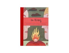
In the first year of the war in Ukraine, the author regularly conducted separate interviews with a Ukrainian journalist and...
In the first year of the war in Ukraine, the author regularly conducted separate interviews with a Ukrainian journalist and a Russian artist. Talking to an outsider gave each of the protagonists a platform. As an illustrator, she decided to depict their disturbing and gruesome testimonies via the medium of a graphic diary.
The double-page spreads juxtapose these different voices – the Ukrainian one on the left, the Russian on the right. Each is given a distinct colour scheme – beige, reddish and violet hues dominate on the left-hand pages, while the right-hand pages are in bluish, greenish and brownish hues. The accounts from the two countries are allowed to speak for themselves, while setting them opposite each other gives them equal weight. The result is a biographical duel in 52 rounds, with a bled-off thumb index guiding you through the weeks of the year. Rarely do news broadcasts offer such a multilayered portrayal.
Lined boxes of varying widths are grouped around a panel. They contain texts in a lettering font whose handwritten look is perfectly suited to these personal testimonies. The illustrations present heavily cropped, snapshot-like scenes; the narrators’ hands and arms can be seen but never their entire faces. As a visual style, it’s the antithesis to the endless mass media images that separate the visual focus from the context of events. With its manifestly higher level of abstraction, this kind of slow medium cuts deeper – it speaks to you directly.
- Publisher:
- Topic:
- Non-fiction
- ISBN:
- 978-3-328-60325-2
- Author:
- Nora Krug
- Illustrator:
- RAUM Italic / Barbara Gizzi
- Pages:
- 128
- Price:
- € 28.00
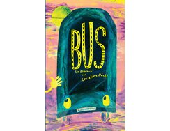
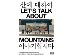
Cloth-embossed paper clads the stiff cover boards of this slender, almost classically formatted book. With its sections of glossy print...
Cloth-embossed paper clads the stiff cover boards of this slender, almost classically formatted book. With its sections of glossy print varnish, it’s a surface that recalls the printed upholstery of public transport seating.
The titular bus is almost full, even though it’s still dark outside. Everyone is tired and the mood downbeat. A striking-looking figure gets on, chooses a seat next to someone with “YEAH” printed on their baseball cap and says, “Hiiiii!”. But no one feels like talking.
Bushes and trees feature lush, vibrant green foliage, red accents amplify the dominant cyan, and violet details elevate the bold yellow. Wax crayon has been overpainted in layers until it gets greasy, then been scratched away again to reveal the surface beneath, repeatedly teasing out little details. Thanks to frequency-modulated screening, the nuances of colour and texture are evenly and superbly reproduced. As a result, the images, pop luminously against the matt paper.
The odd juxtaposition of grumpiness and eccentricity in this thrown-together group promises to quickly lift the mood. Passengers respond with a mix of irritation and amusement – “huh!” says one, “hmmyeh” another – as outside it gradually starts to get light. The anarchic images never feature complete sentences, just interjections that float out of the bus’s windows in speech bubbles. By the end, there’s a tour party atmosphere as the bus hurtles round bends.
- Publisher:
- Topic:
- Children’s/young adult book
- ISBN:
- 978-3-948743-23-9
- Author:
- Claudia Röckl
- Illustrator:
- Claudia Röckl
- Pages:
- 36
- Age:
- 3+
- Price:
- € 22.00
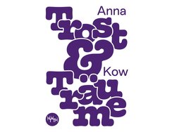
Some things turn out to be not as you had imagined, and others to be entirely imagined or dreamed up....
Some things turn out to be not as you had imagined, and others to be entirely imagined or dreamed up. These candid stories are about people’s experiences of coping with everyday life – and also help readers to cope themselves. They come in a handy pocket-sized book that can easily be carried around for whenever solace is required.
The use of dark violet lettering throughout brings an intimate atmosphere to the peach-coloured paper. Another technically simple trick is the combination of two type styles with contrasting characters. Apart from certain lyrical details, such as the open loop of the g’s descender or the curve of the lower case k, the body matter has a mostly sober look, with the contemporary sans serif font being ideally suited to the stories’ frank confessions. The daytime “awake” texts are printed positively on warm-hued paper, while the night-time “dream reports” are negatively printed on a violet background and in a much larger point size. A second type style for the headings emphasises the serifs, to such an extent that they take up more than a third of the x-height. The effect is rather like when colour leaks into the background from a felt pen. The huge point size used on the dust jacket, meanwhile, inflates the font so much that its bulbousness comes to the fore.
The even fluctuation of the ragged type, the soft colour of the foredges and the flawless finish show how harmonious a turbulent interior life can look.
- Publisher:
- Topic:
- Fiction
- ISBN:
- 978-3-945849-29-3
- Author:
- Anna Kow
- Illustrator:
- Katharina Zimmerhackl
- Pages:
- 144
- Price:
- € 14.00
Life by Berlin’s Kottbusser Tor; bridges and subways; a post-Soviet dacha colony; housing cooperatives; public safety concepts; a meeting house;...
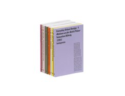
Life by Berlin’s Kottbusser Tor; bridges and subways; a post-Soviet dacha colony; housing cooperatives; public safety concepts; a meeting house; urbanism in Eastern Romania; informal dwelling practices – these are the subjects tackled in this series of eight volumes (and counting), which arose out of projects at Hamburg’s HafenCity University.
Technical simplicity is part of its design concept: the books are all glue-bound paperbacks, and each is printed in a single colour. At first glance, the different-coloured covers seem to be the only thing that distinguishes the volumes – apart from the different title lines of course – but when you run your fingers over them, you realise with surprise that the cardstocks vary ever so slightly from one cover to the next – their surface is either ribbed, lined, leathery or cloth-like.
The individual approach of each study is reflected in editorial differences. For a series, however, an overarching visual concept needs to be found, otherwise it wouldn’t be a series. In this series, the blurb, which would conventionally be on the back, is right on the front cover – and set vertically. Inside, the flexible typographical structure is similarly radical. Not only do the vertical footnotes, which are set within the column of body matter, create a new kind of page design, sometimes even entire sections plus accompanying illustrations are inserted into the main body. Also not where you’d expect is the bar code, which is subsumed into the vertically stacked cover lines.
- Publisher:
- Topic:
- Non-fiction
- ISBN:
- 978-3-946056-14-0
- Author:
- Ruth Duma-Coman, u.a.
- Illustrator:
- Our Polite Society / Laslo Strong
- Price:
- € 13.00
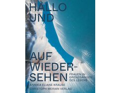
Here we have nine women preparing for literal life or death situations – some are approaching childbirth, others nearing their...
Here we have nine women preparing for literal life or death situations – some are approaching childbirth, others nearing their end. The photographs don’t try to convey anything spectacular, but are captivating and moving all the same; after all, they show us something existential that our society mostly sanitises or makes taboo. Common to all these memorable images is a muted atmosphere, with indirect light and warm hues in fine gradations surrounding dark patches of shadow. They are printed on matt, absorbent paper, an entirely appropriate surface.
The portrait chapters alternate between birth and death. Generous double-page spreads introduce each portrait with names and dates in large characters. A particularly striking detail is how the crotch widens out at the inside angles where curves or diagonals meet other strokes. Known as ink traps, these gaps ensure the ink doesn’t run beyond the letter edges, particularly in small point sizes – a subtle metaphor for care provision perhaps. During the project, the photographer trained both as a doula and as an end-of-life care assistant.
Colour gradations adorn the introductory pages. For birth, a warm pink tone radiates from the middle of the book. For death, the direction is reversed, with paper white emanating from the gutter like a ray of light. Gradations feature on the endpapers too. The design thus visualises the subject matter via a positively minimalist allegory: birth and death as passage.
- Publisher:
- Topic:
- Non-fiction
- ISBN:
- 978-3-03969-023-7
- Author:
- Annika Eliane Krause
- Illustrator:
- Atelier Nord
- Pages:
- 240
- Price:
- € 34.00
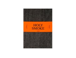
Packaging as metaphor: this book comes parcelled up in carbon paper and enclosed in a glowing orange belly wrapper. You...
Packaging as metaphor: this book comes parcelled up in carbon paper and enclosed in a glowing orange belly wrapper. You slip off the wrapper, then unpack the book from the thin carbon paper. In the process, the black of the paper gets onto your fingers, and from there onto the grey cloth cover of your nice new book. The cover is printed with black silhouettes of censers that now call to mind lumps of charcoal.
People use sacred smoke to send messages to higher powers. This book is about the vessels used to disseminate such smoke and their role across different religions and eras. The thin, slightly translucent paper echoes the ethereal subject matter, while the print quality of the images is positively miraculous, with the sheen of a polished bronze Egyptian tripod censer or a glazed Japanese censer still apparent despite the absorbent paper. The objects have been meticulously photographed, their details carefully preserved through the prepress stages and then teased out via judicious printing.
The type area blends symmetric and asymmetric features. Left-aligned introductory texts use a larger font and fill the width of the page. Traditional fully justified blocks sit high up on the page, leaving wide outer and lower margins. The resulting elegant look calls to mind the days when books were heavily used and repeatedly refurbished by binders – more importantly, these wide margins help readers to avoid smearing the type area with carbon-blackened fingers.
- Publisher:
- Topic:
- Non-fiction
- ISBN:
- 978-3-7774-3948-8
- Author:
- Claudia Brittenhan, Béatrice Caseau, Claire-Marie Caseau
- Illustrator:
- Kaj Lehmann
- Pages:
- 338
- Price:
- € 49.90
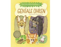
Even the map of the world on the front end paper is unconventional, it uses a projection that reflects actual...
Even the map of the world on the front end paper is unconventional, it uses a projection that reflects actual surface area. Similarly unconventional is the novel criterion this read-aloud book uses to categorise animals, namely the shape of their ears.
Each animal representing a particular ear shape is depicted on a double page, with a large display image on the left-hand side and brief texts plus detail images opposite – the latter are either isolated or set in rounded boxes. All manner of typesetting styles are used: ragged left, ragged right, centred, justified, shaped. The typefaces are hand-lettered, be it the font for the typeset matter or the individually drawn lettering for the species names – the body matter is dark brown, while the names are colour-matched to the animals. A glossary and an index provide genuine reference-work functionality. On the back end paper are outlines of the animals in proportion to their actual sizes.
In mische technique, the illustrations feature a pastel palette of green, yellow, sand and brown hues. The book pages look as though they are bathed in soft, scattered light, while spatial depth comes not just from the usual shading, specific individual elements also seem to have been brightened with pale chalk, which lifts them from the background. Another trick enables the paper white to be used like a colour: by generally adding just a few per cent of yellow to the white spaces, the lightest bits of the drawings seem even brighter than their surroundings.
- Publisher:
- Topic:
- Children’s/young adult book
- ISBN:
- 978-3-314-10673-6
- Author:
- Lena Anlauf
- Illustrator:
- Lena Anlauf, Vitali Konstantinov
- Pages:
- 64
- Age:
- 5+
- Price:
- € 25.00
The Robert brothers have not thus far greatly interested art historians, their paintings being dismissed as overblown romanticism. The elder...
The Robert brothers have not thus far greatly interested art historians, their paintings being dismissed as overblown romanticism. The elder brother, Léopold, gained a thorough education in Paris before moving to Italy in 1818. Aurèle soon followed. Combining the elegance and the anatomical precision of Renaissance artists with the complex compositions and energy of history paintings, the Roberts turned scenes of everyday rural life into theatrical dramas of ancient dignity.
A recent exhibition looking back at the work of these Swiss brothers was accompanied by an opulent catalogue that serves as an enduring souvenir. The titleless front cover has an almost magnetic appeal, its cropped painting immediately grabbing the attention. We see two faces in profile, cut off by the extreme bleed; they, meanwhile, are focusing intently on something beyond the frame. A lower arm emerging from a rolled-up shirt sleeve is thrust upwards, though, again, its hand is beyond the image’s edge. The pale blue of the sky contrasts with the lively colours of a hat. Each brushstroke is clearly visible, as is the craquelure of the ageing paint. Echoing the gloss varnish of a painting, the cover paper is varnished, though only on the front.
A narrow strip of the neon-green spine extends into the hinge; spine and back cover are matt and absorbent, like the paper of the inside pages. The front end paper is solid neon green, delivering a refreshing jolt of garish colour – and inviting the reader to take a fresh look at the work of the brothers Robert.
- Publisher:
- Topic:
- Non-fiction
- ISBN:
- 978-3-85881-887-4
- Author:
- David Lemaire, Antonia Nessi
- Illustrator:
- onlab / Thibaud Tissot, Vanja Golubovic, Matthieu Huegi
- Pages:
- 264
- Price:
- € 48.00
The opening line gets straight to the point: “What can an exhibition about North Korea show us if it can...
The opening line gets straight to the point: “What can an exhibition about North Korea show us if it can only show what it’s allowed to show?” The editorial starts on page one, right below the title lines. Lengthy photo series and lively typography create a magazine aesthetic. Generous lead-in pages introduce the essays; monumental sans serif capitals contrast with the brushwork style of Korean letters. The type area uses two- and three-column variants. Both versions allow for wide gutters without and wide margins within; quotes in large type jut into these spaces. A pale grey background signifies the beginning of a new article.The camera team behind the images followed various “rules”, including that heads of state should always be shown in long shots, while cropping was frowned upon. Other individuals are also often shown in statuesque poses in the centre of the frame. The landscapes, cityscapes, hotel lobbies and street scenes all look perfectly composed. Subject and cinematography form a symbiotic relationship: the officially chosen subjects and their cinematic dramatisation create dioramas that are akin to stage sets.
Contemporary Western pop culture has a penchant for this kind of visual atmosphere. We are drawn to its pleasing nostalgia, its modern cult appeal. Flicking through the film stills, you barely notice the featherweight paper; it’s almost like swiping a display – yet another way in which this print magazine captures the project’s moving picture character.
- Publisher:
- Topic:
- Non-fiction
- ISBN:
- 978-3-86043-065-1
- Author:
- Mike Fässler, Beat Hächler
- Illustrator:
- UPSET / David Lüthi, Mirko Leuenberger
- Pages:
- 204
- Price:
- € 10.00
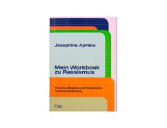
Instead of an introduction, the author starts with an invitation. Her target audience is not just privileged members of the...
Instead of an introduction, the author starts with an invitation. Her target audience is not just privileged members of the white majority, but also those affected by racism themselves. It doesn’t seek merely to identify, discuss and reflect on the issues, rather it aims to advance the fight against racism via regular introspection.
The methodology presented in the workbook’s three chapters combines personal questions, suggestions and specific instructions. Ample space is provided for the reader to note down their own thoughts and responses. These generous blank spaces are subtly structured: soft lines in pink, yellow and green create a variety of gridded layouts that call to mind school exercise books. The cells of the grids start out small, but gradually increase in size and gain text boxes with rounded corners that enliven the layout. Cover, front matter and chapter pages feature overlaid blocks of colour that call to mind index cards with rounded tabs for labelling. This might evoke associations such as education, bureaucracy and perhaps even category thinking, but the freely composed designs also exude a cheery mood.
This is a book that can be put to practical use – as a workbook or even a diary – not just because its uncoated paper is easy to write on, but also because it opens perfectly – a metaphor perhaps for the reader being able to open up – thanks to an outer spine that flips back with the front cover, laying bare the book block’s sewn binding.
- Publisher:
- Topic:
- Non-fiction
- ISBN:
- 978-3-9823681-2-2
- Author:
- Josephine Apraku
- Illustrator:
- Studio Amanda Haas / Amanda Haas
- Pages:
- 160
- Price:
- € 24.00
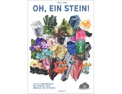
With its bold sans serif type, this sizable tome references the non-fiction typography of the 1960s. Also worthy of note...
With its bold sans serif type, this sizable tome references the non-fiction typography of the 1960s. Also worthy of note are its impressive chapter pages, generous visuals and macro images of crystals, while the front of the straight-cut cardboard cover boasts a colourful conglomerate of fabulous crystals.
It is, as the cover says, “a spotter’s guide featuring quite a lot of minerals and rocks”. Next to those semi-serious lines is a pile of poop. A spoof then? Amidst the neatly set texts in bold Akzidenz-Grotesk, someone has even scribbled comments like a schoolboy might. Perhaps the whole thing is a send-up of Goethe’s minerals collection…
The illustrations of rocks and crystals have a naturalistic look, though their thickly applied paint has been merrily dragged and dabbed with the brush. The author introduces us to the likes of vesuvianite, vermiculite, sodalite, axinite and tetrahedrite in an unfailingly insouciant manner. It’s compelling because, for all his irreverence, the artist fully embraces the child-like illustration style while still accurately capturing the distinguishing characteristics of forms and colours. The result, despite the uninhibited style, is visuals that are almost worthy of an Old Master. The writing is equally uninhibited: “Calcite crystallises trigonally and is transparent. Fact. It can, however, take on a shitload of shapes and colours.” An interesting approach to the dissemination of knowledge.
- Publisher:
- Topic:
- Non-fiction
- ISBN:
- 978-3-8479-0155-6
- Author:
- Felix Bork
- Illustrator:
- Felix Bork
- Pages:
- 304
- Price:
- € 36.00
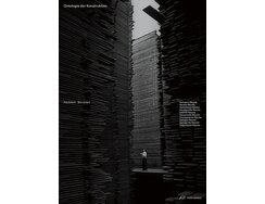
The authors identify ten archetypes within the world of architectural structures. These are described in chapters that use two different...
The authors identify ten archetypes within the world of architectural structures. These are described in chapters that use two different types of text: the key principles are explained in a left-aligned, four-column type area with a serif font; the ensuing case studies are spread across three columns of justified, sans serif type. Sometimes these two column variants feature on the same double page, which makes for a lively yet coherent page design. The case studies are presented in image spreads featuring both colour and black-and-white photographs. Their details and tonal values are reproduced with the utmost precision thanks to frequently modulated screening. In fact, the individual dots are so fine that, even with a magnifying glass, you can barely make them out.
The full-page photos leave the type area’s narrow outer margin blank, only running to the page edges at the top, bottom and gutter. This allows the black chapter dividers to create fine lines on the book block’s edges – and thus serve as a kind of thumb index. Those blank outer margins mean the page numbers and captions have been shifted inwards slightly.
The weight of the book demands a sturdy binding. The sewn book block makes it fundamentally stable, while the lay-flat binding ensures the block feels supple even from the outside – the heavy cardstock cover, whose black is elevated by silver overprinting, is only attached to the first and last sheet. The result is a hollow spine that won’t break when the book is opened.
- Publisher:
- Topic:
- Non-fiction
- ISBN:
- 978-3-03860-361-0
- Author:
- Piet Eckert, Wim Eckert
- Illustrator:
- hla.studio / Tobias Dahl , Patrick Martin
- Pages:
- 316
- Price:
- € 38.00
Up until the end of the image-hungry 19th century, draughtsmen supplied the printing industry with woodcuts; it wasn’t until after...
Up until the end of the image-hungry 19th century, draughtsmen supplied the printing industry with woodcuts; it wasn’t until after 1880 that the technique known as dithering made photography viable for mass media use. Even then, photographs destined for printing were still often just raw material, having to be hastily touched up by hand (and brush) – their lines sharpened or emphasized, or their figures isolated.
Press photographs, vast quantities of which came onto the market after analogue image archives were dissolved, served as the starting point for the Press Paintings series. The artist focuses our attention on the retouching. The original images are nothing more than waste products from the process of preparing copy for the presses. While we now marvel at how artificial intelligence autocreates images by using the world’s entire stock of digital images as its “palette”, we still hold to the veracity of photographic images; they, after all, capture reality in objective and unmanipulated fashion via the exposure of film to light.
Across the magazine-format, newsprint-thin pages, spreads of images alternate with others that are completely blank but for their inconspicuous page numbers – a subtle reference to the images’ orphan status, to their removal from their editorial context. Towards the back of the book, image-only spreads then alternate with text-only spreads whose three-column layout is dictated by the three language versions. Within these columns, blank spaces have been left in which the images can be made out through the thin paper – visual diffusion as a trick of graphic design.
- Publisher:
- Topic:
- Non-fiction
- ISBN:
- 978-3-95905-634-2
- Author:
- Steffen Siegel, Katharina Zimmermann, David Campany
- Illustrator:
- Teo Schifferli with Sebastian Riemer
- Pages:
- 312
- Price:
- € 38.00
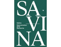
Sabina von Steinbach was a Gothic-era sculptor, or so a historical written inscription informed us, though this has since been...
Sabina von Steinbach was a Gothic-era sculptor, or so a historical written inscription informed us, though this has since been lost. The frieze that immortalised her in stone relief, though, can still be seen – in Berlin’s Alte Nationalgalerie.
Here, the author considers this peculiar story, relating the investigations of the (fictitious) researcher “W.” She uses artistic research to engage with art historiography, juxtaposing two “phantoms” – the legend of a female mediaeval stone mason and the research conducted on the subject by the writer’s fictional alias.
The book’s complex design concept takes this interweaving of fictions seriously. Photographs are painstakingly reproduced, while paper and printing are beautifully matched. The precise matt white foil stamping of the title adds to the tactility of the green cover, which is itself blind-stamped with a pattern. The mysterious spine cites the lost inscription. Inside, the two different text levels are differentiated typographically: a black serif font in a very large point size documents the findings; a much smaller sans serif font presents excerpts from a notebook. The latter also echoes the green of the cover, while all-green pages divide the chapters.
At the back of the book, after the hidden colophon, there’s an epilogue – a conversation between historical functionaries at the Nationalgalerie, brought to life as a typographical drama. The uncertainty over what is or was real is thus prolonged right to the end.
- Publisher:
- Topic:
- Fiction
- ISBN:
- 978-3-86485-290-9
- Author:
- Wiebke Elzel
- Illustrator:
- arc / Timo Grimberg
- Pages:
- 416
- Price:
- € 44.00
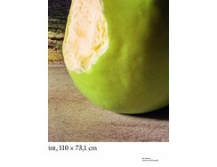
To merely describe this slender folio volume as a catalogue for the photo exhibition of the same name would be...
To merely describe this slender folio volume as a catalogue for the photo exhibition of the same name would be to do it a disservice. Echoing the subject of the exhibition, the graphic design is a self-experiment on whether size does indeed matter.
With not so much as a title page by way of greeting, the first part pitches us straight into the images, which are splashed across page after wordless page. This section, which presents the exhibited works, addresses the question of the ideal size in which to show a detail. For optimum comparison, the images, some of which are two metres across, are shown at a scale of 1:1. Being able to include only a piece of the image, however, inevitably leads to some extreme crops, while hinting at the fact that photography is also always about what you leave out.
It’s almost the middle of the book before we get to the second part, were we at last find the “front” matter. The book continues in display mode. In the table of contents, we thus get lines of outsize type in an elegant italic; these list the titles of the essays that follow. Surprisingly, the essays themselves use a smaller point size than is usual for body matter, which is particularly surprising given the generous format of the book. The punchline, as it were, comes in the form of equally surprising footnotes, where what is usually the small print is reproduced in an enormous point size. Perhaps the question being asked this time is: What importance should we attach to source references?
In the final part, the catalogue proper, all the works are arranged in a completely unstructured type area and shown with huge labels, thereby posing another question, namely: How generous should index typography be?
- Publisher:
- Topic:
- Non-fiction
- ISBN:
- 978-3-95476-633-8
- Author:
- Florian Ebner, Steffen Siegel, Vera Tollmann
- Pages:
- 116
- Price:
- € 36.00
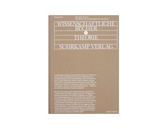
In the 1960s, publishing house Suhrkamp added a philosophy/criticism series to its hitherto exclusively literary list. This study traces the...
In the 1960s, publishing house Suhrkamp added a philosophy/criticism series to its hitherto exclusively literary list. This study traces the development of that series. Its interior design is based on a symmetrical type area, everything else breaks with convention. There are often good reasons for ragged right type, which the body matter employs here, but the use of a bold sans serif font – in inky blue, no less – is most unusual. It tests the limits of readability, with only the large point size helping to counterbalance this risky choice.
The 1,094 notes are testimony to the author’s assiduously researched sources. They are printed in the gutter margins, which have been widened accordingly. Here, too, the text is bolded, although this time it’s in a just about legible point size – nonpareil (“incomparable”) in old printing terminology. The contrast to the body matter is further underlined by the use of a second spot colour, an ochre brown.
The positioning of the page numbers is equally unusual; they are centred at the top of the gutter margin, i.e. above the marginal notes. Source citations, the most controversial part of an academic work are thus juxtaposed with centring, traditionally the clearest expression of typographical self-confidence. All these characteristics combine to set the tone for the reader. The inky blue calls to mind manuscripts and carbon paper, while the ochre brown echoes the colour of folders. The combination of the two – along with the supple, flexibound softcover – adds pep, or even pop, to the design.
- Publisher:
- Topic:
- Non-fiction
- ISBN:
- 978-3-95905-242-9
- Author:
- Morten Paul
- Illustrator:
- Lamm & Kirch with Caspar Reuss
- Pages:
- 350
- Price:
- € 34.00
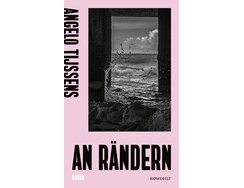
Stacked lines of text on white paper rectangles are a defining feature of book interiors. The proportions of those rectangles...
Stacked lines of text on white paper rectangles are a defining feature of book interiors. The proportions of those rectangles mostly follow the traditional quarto format, while reading conventions generally prescribe justified serif type and black ink on matt paper.
Here, though, typographical convention goes out the window. A broad lower margin forces the columns high up the page. Each is set asymmetrically – and thus pushed towards the titular edges (the book’s English title is The Edges). This creates what almost looks like a blank marginal column in which the reverse printing shows through the paper, offset from the printing on the front. The novel itself is about the traumatisation of queer people. The story develops slowly, with blank lines inserted between the paragraphs like dramatic pauses, or as if to catch breath.
It not only has no table of contents, it also lacks page numbers – although lack isn’t really the right word. Let’s just say there aren’t any – do we really need them? Instead, there’s a bookmark ribbon to directly mark your place. The black of sans serif Roman numerals in an ultra-condensed bold weight provides sparing contrasts with the white and corresponds to the black of bookmark and endband. Positioned where you’d otherwise find initial letters, they mark the beginning of a new chapter.
The front matter echoes the way the dust jacket visual plays with black spaces – dark versus light, frame versus opening – and thus connects the book’s interior with its exterior.
This is typography at its most considered.
- Publisher:
- Topic:
- Fiction
- ISBN:
- 978-3-498-00400-2
- Author:
- Angelo Tijssens
- Illustrator:
- Anja Sicka
- Pages:
- 128
- Price:
- € 22.00
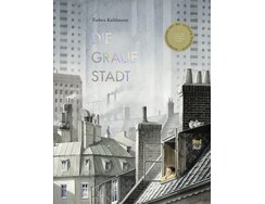
The front cover illustration shows smooth, gridded façades looming in the background above roofs and brick chimneys. Even before the...
The front cover illustration shows smooth, gridded façades looming in the background above roofs and brick chimneys. Even before the first chapter begins, the leaden atmosphere grows heavier still: in a cityscape that blends Los Angeles, Paris and Hong Kong, elevated urban motorways arc past dormer-studded mansard roofs set against a backdrop of towering skyscrapers. All this is rendered in positively meticulous fashion in fine gradations of monochrome shading – and therein lies the nub of the story.
On the very first day after her family’s move to a new city, daughter Robin realises that the future is anything but bright. At first you could be forgiven for thinking the sombre visual mood is simply down to the dreary weather. But when Robin stops at a paint shop and peers in through the window, we see her eyes widen as she understands that there’s something very wrong here. All the tubes contain grey paint – mouse grey, ash grey, green grey, stone grey. In fact, every single thing in this city is grey. A dystopian crime story then unfolds as we discover that the greyness is systematically organised: the city is run by a kind of grey cartel.
A striking detail is the mix of cars on the roads: there are American gas-guzzlers alongside East German Trabants and other 1970s models. Thanks to such retro touches, the cinematically composed images send a subtle message that both planned economies and consumer societies can lead to uniformity. Without wishing to give any spoilers, let’s just say that, as the tale unfolds, the reader learns the difference between subtractive and additive colour mixing.
- Publisher:
- Topic:
- Children’s/young adult book
- ISBN:
- 978-3-314-10652-1
- Author:
- Torben Kuhlmann
- Illustrator:
- Torben Kuhlmann
- Pages:
- 64
- Age:
- 8+
- Price:
- € 20.00
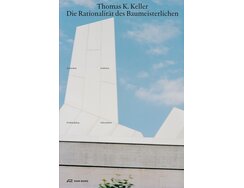
This large-format volume presents an architectural practice’s work via an unusual visual strategy. Numerous versions of the same image, in...
This large-format volume presents an architectural practice’s work via an unusual visual strategy. Numerous versions of the same image, in the same format, are grouped together. A marketing manager would have insisted on a cull.
There’s no selective focusing on the best aspect, statuesqueness is positively avoided and all aspects are given equal weight. You cock your head, shift a little to one side, pause – and shift from just seeing to reflecting. Gradually you realise that it’s about positions within space, about light and shade, about sharp and blurred lines, in everything right down to cloud formations. The high level of redundancy in the images thus has a didactic function. It’s about a school of observation that encourages a deeper understanding of the apparently self-evident.
The aim of this book is not to celebrate architectural splendour in full-page, blue-sky photographs. In fact, large-format images are notable by their absence. Instead, delicate architectural plans are arrayed across double-page spreads and set against pale-grey backgrounds that call to mind unfurled tracing paper. They show us how it’s done in technical detail.
The columns of the rigid type area contain two different kinds of text and utilise just two point sizes. Right-hand pages feature programmatic essays on the chapters, full justification, plus centred page numbers and page headings; left-hand pages provide context via four narrow columns in a small point size, the latter’s ragged right setting undogmatically balancing the aesthetic requirements of the rag and the need for reader-friendly word breaks.
- Publisher:
- Topic:
- Non-fiction
- ISBN:
- 978-3-03860-322-1
- Author:
- Thomas K. Keller, Bänziger Hug / Samuel Bänziger, Michel Egger
- Pages:
- 284
- Price:
- € 48.00
Contact
Carolin Blöink