
Best German Book Design 2024
Stiftung Buchkunst awards the best german book design of a year, offers a platform for rethinking the medium of the book with the sponsorship prize for young book design, and networks international book design competitions under the umbrella of best book design from all over the world.
Single title
Museums are places where things are collected, archived, preserved, researched and presented. Up to now, their displays have been the...
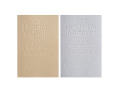
Museums are places where things are collected, archived, preserved, researched and presented. Up to now, their displays have been the means via which the museum connects with the public. A broader view of what a museum can be might flip this provider/recipient relationship around and turn museums into places where people feel welcome, free from discrimination and socially relevant. This was among the issues discussed in the Berlin Conversations on Mental Health at Berlin’s Gropius Bau, and it is summed up in the title of the resulting publication: The Resonant Museum.
Arranged alphabetically under keywords, the texts form a kind of handbook. In the first section, essays provide inspiration; like voices from the off, they are negatively printed in white on black. Then come excerpts from the conversations. Instead of an abrupt switch from one to the other, we get a gentle transition thanks to a gradual brightening of the black backgrounds that’s suggestive of light creeping into dark places. The content is repeatedly interrupted by double-page photographs of the Gropius Bau that allude to its history as a prestigious public building, ruin and rescue project.
The book is not bilingual but does come in two almost identical language versions. The cover cardstock of the English edition is sand-coloured, while the German comes in pale grey. The two also differ in the brightened black of their single-colour printing – a reddish black for the English and a bluish black for the German. The cover’s repetition of the blind-stamped title, meanwhile, resembles a reverberating echo.
- Publisher:
- Topic:
- Non-fiction
- ISBN:
- 978-3-7533-0479-3
- Author:
- Beatrice von Bismarck, Priya Basil, Stephanie Rosenthal
- Illustrator:
- Studio HanLi
- Pages:
- 222
- Price:
- € 18.00
Drawing on her own life story, the author assesses the extent to which the media are systematically complicit in the...
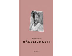
Drawing on her own life story, the author assesses the extent to which the media are systematically complicit in the surgical standardisation of female beauty, given the domination of instant-gratification industries. She illustrates her sociological reflections with artistic self-portraits and the use of historical images.
The cover image is both disturbing and captivating: an eye gazes at us contentedly from a scrunched-up black-and-white portrait of the author as a young girl. It’s all that remains of her once unselfconscious attitude to having her picture taken. Now the crumpled paper has disfigured the youthful face, destroying its carefree air. It’s an image that is repeated on both endpapers.
The cover’s unusual colour is a recurring theme, returning on the endpapers and chapter dividers. It looks almost as though the surface has been dusted with a homogeneous, opaque layer of face powder – or colour-matched to the dull plastic skin of a doll. It’s exactly this tonality that sharpens our gaze for how the cosmetic industry’s impact cuts deep. A “moralising understanding of beauty” forces women to engage in self-optimisation, to subject themselves to the pressure of conformity. As the author writes, “We modify our images until they no longer match our faces, until they become the faces of others, until it’s our faces we’re adapting to the images, until our faces conform to the images.”
- Publisher:
- Topic:
- Fiction
- ISBN:
- 978-3-446-27682-6
- Author:
- Moshtari Hilal
- Illustrator:
- Carl Hanser Verlag / Iris Kochinka
- Pages:
- 224
- Price:
- € 23.00
This bed-time story is about the enchanting life of a grandma in a fantastical forest. She’s not just an abstract...
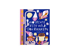
This bed-time story is about the enchanting life of a grandma in a fantastical forest. She’s not just an abstract figure, however; by referring to her as “my imaginary grandmother”, the narrator establishes a personal connection.
The basic colour scheme sets warm inky blue against cool bronze-tinged ochre, with a palette of pink, pale beige, light blue and light yellow spanning these two poles. Within this sophisticated framework, the author uses her keen compositional eye to imbue the episodic double-page spreads with a captivating vibrancy. The stylised forms feature simple, mostly rounded outlines that, although they initially seem like digital vector graphics, exhibit minimal deviations that testify to their careful, manual creation. Further evidence of the analogue approach can be seen in the spattered dots of the sparingly used shading.
To go back to the predominantly curvilinear forms: the circle – the perfect curve – is a recurring theme that features in all conceivable sizes. It is the glue that holds the compositions together, uniting everything from the i-dots and umlauts to the full stops in the two-line rhymes. It’s not immediately obvious whether the lettering is in a humanist font or whether it was penned by hand. In the end, it doesn’t really matter because such ambiguity is integral to the book’s underlying charm.
- Publisher:
- Topic:
- Children’s/young adult book
- ISBN:
- 978-3-96451-046-4
- Author:
- Julia Kluge
- Illustrator:
- Julia Kluge
- Pages:
- 28
- Age:
- 4+
- Price:
- € 15.00
If it doesn’t have pages, is it still a book? Here, a pile of folded papers are assembled in a...
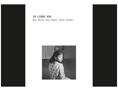
If it doesn’t have pages, is it still a book? Here, a pile of folded papers are assembled in a small black slipcase. There are almost two dozen A4 sheets, cross-folded the way love letters used to be, back when people still wrote such things. A belly wrapper prevents them from sliding out of the case.
The highly romantic idea behind this publication is to breathe new life into old photographs that had been slumbering anonymously on flea markets. Authors were invited to revive a dying cultural practice – the writing of love letters. Each was assigned a particular photo and asked to indulge their imagination. We form emotional attachments to artefacts, but we also attach memories to such artefacts – photographs in particular. Here the associated memories may have been lost, but the photos have been given the kiss of life. Written in an unpretentious typewriter font, each love letter is loosely enclosed with the corresponding image, creating a new connection between text and image.
The letters come in the form of eight-sided folded sheets, placed one on top of one other. The result looks almost like a book block. There’s no conventional edge binding as this would prevent the letters from being opened. Instead, the sheets are held together via the combination of slipcase and wrapper. Does that make it a book after all?
- Publisher:
- Topic:
- Non-fiction
- ISBN:
- 978-3-948174-21-7
- Illustrator:
- Helena Melikov
- Price:
- € 26.00
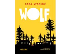
The tension is high from the start, thanks to the playfully stroppy but very self-aware pronouncements of the first-person narrator....
The tension is high from the start, thanks to the playfully stroppy but very self-aware pronouncements of the first-person narrator. The dynamic within this group of youngsters reveals that holiday camp can be less than fun.
For a story book, the format is quite broad, though the large type size, chosen to reflect the young age of the book’s readers, offers an explanation. Also worthy of note is the non-hyphenated, ragged-right type, though this, too, is a valid choice; it avoids gappy justified text and prevents the reader’s flow from being interrupted, albeit at the expense of the aesthetic ideal of perfectly justified text. The type area with its upright, unassuming serif font is anything but impenetrable, large spacings and wide margins help to guard against flagging attention, while a yellow spot colour, used for the bold, sans serif page numbers and illustrations, enlivens the page design.
The ratio of text volume to sparingly employed, stylistically homogeneous images ensures it never comes across as a picturebook; at the same time, the full-bleed, double-page brush illustrations act almost like stage sets. Illustrations are also set within text pages, featuring as vignettes, isolated drawings and even surrounded by a column of shaped type. And then there are those nasty little mosquitoes, a recurring ornament throughout the book. The wolf at the door, however, refers the narrator’s own ill-defined fear.
- Publisher:
- Topic:
- Children’s/young adult book
- ISBN:
- 978-3-551-65204-1
- Author:
- Saša Stanišić
- Illustrator:
- Regina Kehn, Carlsen Verlag / Derya Yildirim
- Pages:
- 192
- Age:
- 11+
- Price:
- € 14.00
Contact
Carolin Blöink